

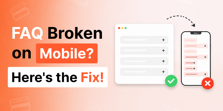
You spent an afternoon building the perfect FAQ section. On your laptop it’s flawless: clean columns, balanced spacing, questions sitting side by side like a well-set table. You hit publish, feel good, and move on.
Then a customer texts you a screenshot from their phone.
The questions are crushed into a thin strip. The text wraps after two words. One answer is cut off entirely, hiding behind the edge of the screen. The neat side-by-side layout that looked so confident on desktop has folded in on itself, and the whole thing looks less like a polished FAQ and more like a parking ticket that went through the wash.
If you’ve lived this exact moment, you’re not careless and your plugin isn’t broken. You’ve hit one of the most common — and most quietly damaging — problems in web design: a layout that was built for a wide screen and never told what to do on a narrow one. The good news is that the fix is specific, repeatable, and takes minutes once you understand what’s actually happening.
This is the why, and the breakpoint fix.
Why Does a FAQ Accordion Look Fine on Desktop but Break on Mobile?
A FAQ accordion breaks on mobile because the layout that works at 1440 pixels wide physically cannot work at 390 pixels wide, and most setups never define what should change in between.
Three things are usually going wrong at once:
1. The layout direction is wrong for the screen.
Horizontal accordions, image accordions, and multi-column FAQ grids are designed to expand sideways. A horizontal accordion that reveals content to the right looks elegant on a desktop, where there’s room to the side. On a phone, there is no “side.” The available width is a narrow vertical column, so a horizontal layout gets compressed into something unreadable — thin panels, truncated titles, content that overflows or clips.
2. The widths are fixed instead of fluid.
If a column is set to a fixed pixel width, it stays that width no matter how small the screen gets. A 600-pixel panel on a 390-pixel screen doesn’t shrink gracefully; it spills off the edge or forces a horizontal scrollbar, which is the cardinal sin of mobile UX.
3. The touch targets are too small.
Desktop design assumes a precise mouse pointer. Mobile assumes a thumb. When titles, toggle icons, and tap areas are sized for a cursor, mobile users end up mis-tapping, opening the wrong question, or pinching to zoom just to read — friction that sends people back to the search results instead of your content.
None of these are visible on your desktop, which is exactly why the problem ships. You test on the screen in front of you, it looks perfect, and you never see what the phone sees.
Why This Matters More Than It Looks
It’s tempting to treat a squished FAQ as a cosmetic annoyance. It isn’t.
Most of your traffic is mobile.
For the majority of websites, more than half of visitors arrive on a phone, and for local businesses, stores, and content sites that share heavily on social, it’s often far higher. A broken mobile FAQ isn’t an edge case affecting a few people — it’s the experience your primary audience is having.
It costs you sales and support time.
FAQs do quiet, important work: they answer the objection that was about to stop a purchase, and they deflect the support ticket that was about to land in your inbox. When that content is unreadable on mobile, the objection goes unanswered and the customer either leaves or emails you the question anyway. The thing you built to save time starts costing it.
It hurts you in search and in AI answers.
Search engines evaluate the mobile version of your page first. A FAQ section that triggers horizontal scrolling, tiny tap targets, or cut-off text sends poor mobile-usability signals — and the structured questions inside it are also the exact content that answer engines like Google’s “People Also Ask,” ChatGPT, Gemini, and Perplexity pull from. If your best answer-shaped content lives inside a layout that’s degraded on mobile, you’re undermining your visibility in the two places that matter most right now.
A FAQ that breaks on phones isn’t a small design bug. It’s a leak in conversions, support efficiency, and discoverability at the same time.
What is a Responsive Breakpoint, in Plain Terms?
A responsive breakpoint is a screen width at which your layout is allowed to change.
Think of it as a rule you give the page: “Up to this width, behave one way. Below it, behave another.” The classic breakpoints map to device families — large desktops, smaller laptops, tablets, and phones — but the exact numbers aren’t sacred. A breakpoint should be set wherever your layout starts to look strained, not at some universal magic number.
The reason breakpoints fix FAQ problems is that they let a single FAQ section have two personalities: a confident, spacious layout on desktop and a clean, stacked, thumb-friendly layout on mobile — without you building or maintaining two separate things.
The Breakpoint Fix, Step by Step
Here’s the practical sequence that turns a broken mobile FAQ into one that reads beautifully on any screen. This is exactly how the responsive controls in Easy Accordion are designed to work, so you can follow it directly inside the plugin.
Step 1: Switch the layout direction on small screens
The single highest-impact fix: if you’re using a horizontal accordion, image accordion, or multi-column layout, set it to automatically switch to a vertical, single-column layout on mobile.
Vertical is the natural reading direction on a phone. Each question stacks on top of the next, every title gets the full screen width, and content expands downward into the space phones have plenty of. In Easy Accordion, the auto layout switch does this for you — a horizontal accordion on desktop becomes a clean vertical accordion the moment the screen drops below your chosen breakpoint, with no second build required.
Step 2: Set custom breakpoints to your content, not to a template
Default device breakpoints are a starting guess. Your content is specific. Maybe your titles are long and start wrapping awkwardly at tablet size; maybe your three-column grid only feels cramped below a certain point.
Use custom responsive breakpoints to define the exact widths where your FAQ should change behavior. Preview the section at each width, find the point where it starts to strain, and set your breakpoint a little above it. You’re tailoring the change to your real questions and answers rather than hoping a template’s defaults happen to fit.
Step 3: Let widths go fluid below the breakpoint
Once you’ve crossed into mobile territory, panels and columns should fill the available width rather than holding a fixed pixel size. Fluid widths are what stop the overflow and the dreaded horizontal scrollbar. The accordion should occupy 100% of its container on a phone, full stop.
Step 4: Size titles, spacing, and icons for thumbs
In your mobile breakpoint, give titles a comfortable tap height, increase spacing between items so people don’t fat-finger the wrong question, and make sure the toggle icon is large enough to be an obvious, easy target. The goal is that someone reading one-handed on a train can open exactly the answer they want on the first tap.
Step 5: Preview on a real phone, not just a resized window
Resizing your browser is a decent first check, but it isn’t the same as a real device. Touch behavior, system fonts, and the actual viewport all differ. Before you call it done, open the page on an actual phone and tap through it the way a customer would. That five-minute check is the difference between “looks responsive” and “is responsive.”
A Quick Before-and-After
Picture the same FAQ section, two ways.
Before: a three-column horizontal accordion. On desktop, sharp. On mobile, three columns crammed into one narrow strip, titles broken across four lines each, one answer clipped at the screen edge, and a horizontal scrollbar that nobody asked for. The customer pinches, squints, gives up.
After: the same section, with a breakpoint that switches it to a single vertical column below tablet width. On desktop, still sharp. On mobile, each question now spans the full width, titles read on one or two clean lines, answers expand downward, and the toggle icons are big enough to hit without thinking. The customer finds the answer in seconds and finishes the checkout.
Nothing about the content changed. The only difference is that the layout was told what to do when the screen got small.
The Takeaway
A FAQ that looks great on desktop and breaks on mobile is almost never a content problem — it’s a layout that was never given mobile instructions. The fix is to switch direction to vertical on small screens, set breakpoints to your actual content, let widths go fluid, size everything for thumbs, and verify on a real device.
Do that, and your FAQ stops being the embarrassing screenshot a customer sends you and starts being what it was meant to be: the calm, readable place where objections get answered and support tickets quietly disappear — on every screen, not just the one on your desk.
If you’d rather not wrangle CSS and media queries by hand, the auto layout switch and custom breakpoint controls in Easy Accordion handle all of this visually, so a single FAQ section just works from desktop down to phone.
Frequently Asked Questions
Q1. Why does my FAQ accordion look broken only on mobile?
Because the layout was built for a wide screen and never told what to do on a narrow one. Horizontal or multi-column layouts and fixed pixel widths can’t compress into a phone’s width, so titles wrap, content clips, and a horizontal scrollbar appears. Setting a mobile breakpoint that switches to a single vertical column fixes it.
Q2. What breakpoint should I use for a mobile FAQ?
There’s no single magic number. Common device breakpoints are a starting point, but the best breakpoint is wherever your layout starts to look strained. Preview your FAQ at decreasing widths, find where titles wrap or columns crowd, and set the breakpoint just above that point.
Q3. Should FAQ accordions be horizontal or vertical on mobile?
Vertical, in nearly every case. A phone screen is a narrow vertical column, so stacking questions top to bottom gives each one full width and a natural reading flow. Horizontal layouts are best reserved for desktop, with an automatic switch to vertical on small screens.
Q4. Do collapsed FAQ accordions hurt mobile SEO?
No. Content inside an accordion is present in the page’s HTML and can be read and indexed; it’s simply hidden visually until tapped. What does hurt mobile SEO is poor usability — horizontal scrolling, tiny tap targets, and clipped text — which a responsive breakpoint setup removes.
Q5. Can I make one FAQ section responsive without building two versions?
Yes. With responsive breakpoints and an auto layout switch, a single FAQ section can display a spacious multi-column or horizontal layout on desktop and automatically restack into a clean single column on mobile — one build, every screen. Easy Accordion provides both controls in its visual editor.


Leave a Reply
You must be logged in to post a comment.