
Showcase your WooCommerce products dynamically with the Product Accordion Block 01, where panels expand to reveal product titles, pricing, and key details. With the powerful Product Query Builder, multiple modern templates, built-in search, SEO-ready schema, and smooth transitions, advanced customizations, enhance your shop as you need.
Explore Ready Product Accordion Patterns →
How to Add the Product Accordion 01 Block:
To integrate the Post Accordion 01 block into your layout, follow these steps:
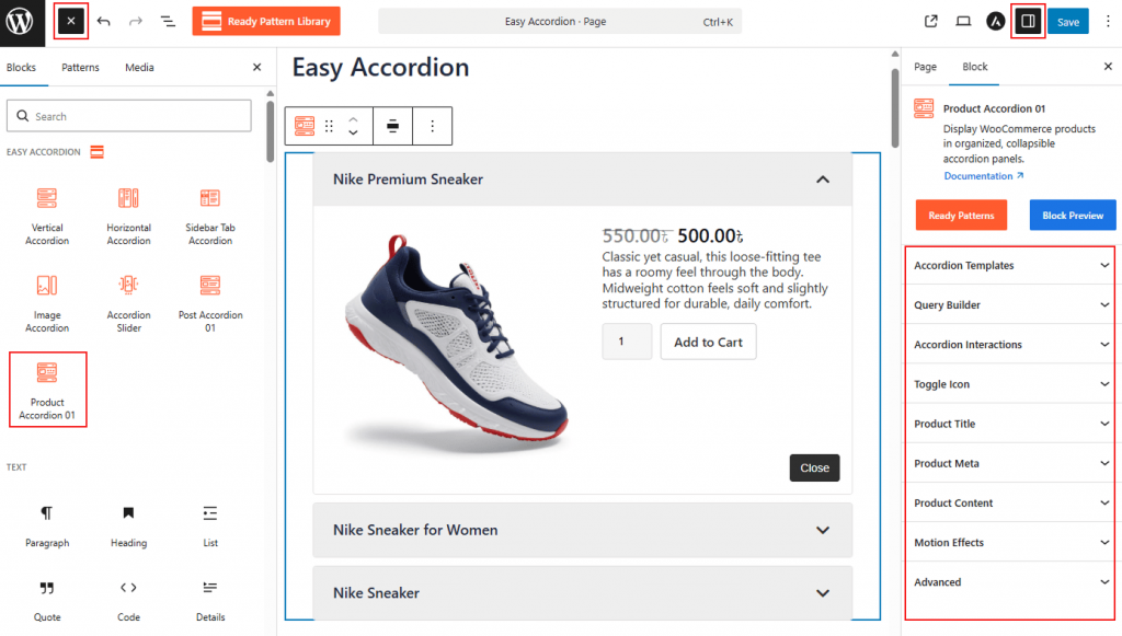
- Go to your WordPress Dashboard.
- Navigate to Pages> Add New (or edit an existing page).
- In the block editor, click the “+” (Add Block) button.
- Search for “Product Accordion 01” under the Easy Accordion category.
- Click to insert the block into your page.
Watch this Video Tutorial to add Product Accordions easily.
How to Customize the Product Accordion 01 Block:
- Modern Templates: Select from various pre-designed layouts specifically optimized for e-commerce.
- Advanced Query Builder: Automatically pull products by category, tag, price, or featured status.
- E-commerce Interactivity: Enable triggers such as Click or Hover, and toggle the display of Price, Ratings, and Add to Cart buttons.
- Full Brand Styling: Tailor the typography, colors, and button styles to create a seamless shopping experience.
Accordion Templates: General
From this panel, you can select the visual structure and layout orientation to define how your product accordions are displayed.
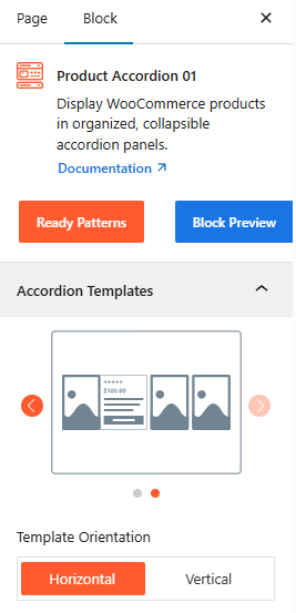
- Template Selection: Choose from two stylish templates to determine the base design of your product accordion.
- Template Orientation: Set the layout to either Horizontal or Vertical to best utilize your page’s space.
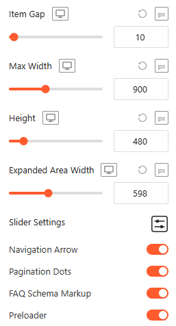
- Item Gap (Accordion): Adjust the vertical or horizontal spacing between individual accordion panels.
- Max Width: Set a maximum width for the entire accordion container to ensure it fits perfectly within your page layout.
Advanced Utilities:
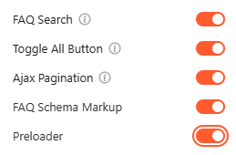
- FAQ Search: Enable a live search bar to let visitors instantly filter through accordion content. For details, visit here.
- Toggle All Button: Enable it to allow users to expand or collapse all accordion items with a single click. For details, visit here.
- Ajax Pagination: Enable seamless page transitions for the post list without requiring a full browser refresh. For details, visit here.
- FAQ Schema Markup: Automatically apply structured data to your content to improve visibility in search engine results. For more details, please visit here.
- Preloader: Toggle on a smooth loading animation that displays while the block’s content is being fetched.
Query Builder:
From this panel, you can define the specific logic and criteria used to automatically fetch and display your products within the accordion.
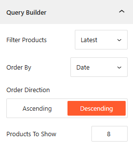
- Filter Product: Choose your filtering method from options like Latest, Taxonomy, Best Selling, Top Rated, On Sale, or a specific product you want to showcase.
- Order By & Direction: Organize your product by Date, Title, or other metrics, and set the display sequence to Ascending or Descending.
- Products To Show: Enter the exact number of products you want to appear within the accordion block.
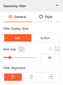
Taxonomy Filter: General
From this panel, you can manage how products are categorized on the frontend for easier user navigation.
- Enable Taxonomy Filter: From the Query builder, simply toggle the Taxonomy filter to make it active.
- Filter Display Style: Choose between a List or Button layout to show product categories for user filtering.
- Display All Button: If you prefer filter display style as the Button, enable this toggle to show the Display All Button text button and customize the Button Label (e.g., “All” or “Everything”).
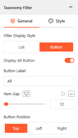
- Item Gap: Set the exact pixel spacing between individual filter items.
- Filter Alignment: Justify the taxonomy filter menu to the Left, Center, or Right of the block.
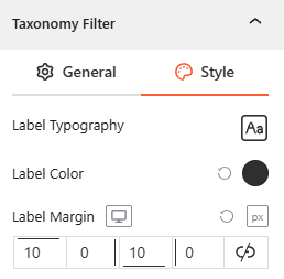
Style Taxonomy Filter:
- Customize the Label & Button Typography, Label Color, and Label Margin to ensure the filter matches your brand’s aesthetic.
Note: If you select Template Two, you will find the more advanced panels to configure the product accordion as needed.
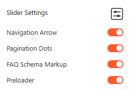
- Slider Settings
- Navigation Arrow
- Pagination Dots
1. Slider Settings
From this panel, you can easily configure the movement and display logic for your product accordion when using a slider layout.
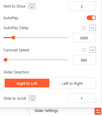
- Item to Show: Enter the exact number of items, such as 3, you want to appear at once.
- AutoPlay: Toggle this on to allow the accordion items to cycle automatically.
- AutoPlay Delay: Set the duration, such as 3000ms, between automatic transitions.
- Carousel Speed: Define the speed of the sliding animation, such as 600ms.
- Slider Direction: Choose the movement flow, either Right to Left or Left to Right.
- Slide to Scroll: Set the number of items, such as 1, that move during each transition.
2. Navigation Arrow: General
From this section, you can configure the behavior and placement of your navigation controls to ensure easy browsing:
- Arrow Position: Select the vertical or horizontal alignment of the arrows, such as Vertical Center.
- Visibility on Hover: Enable this to hide the arrows until the user hovers over the slider area.
- Arrow Style: Choose from a variety of icon shapes and directions (arrows, chevrons, etc.) to match your UI.
- Size & Gap: Adjust the pixel size of the icons and the gap distance between them and the slider edge.
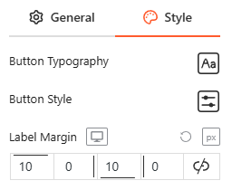
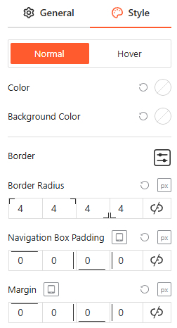
Style Navigation Arrow:
From the style panel, you can fully customize the navigation arrows for both Normal and Hover states by adjusting the icon color, background color, border settings, border-radius, navigation box padding, and external margin.
3. Pagination Dots: General
Configure the visual structure and spacing of the slider’s pagination indicators to improve user navigation:
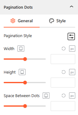
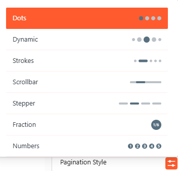
- Pagination Style: Select from diverse presets, including Dots, Dynamic, Strokes, Scrollbar, Stepper, Fraction, or Numbers to match your design preference.
- Width & Height: Set the exact pixel dimensions for the dots across different devices.
- Space Between Dots: Adjust the horizontal gap (in px) between each pagination indicator for a compact look.
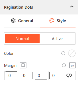
Style Pagination Dots:
You can fully customize the pagination dots for both Normal and Active states by adjusting the color and the external margin.
Accordion Interactions:
From the Accordion Interactions panel, you can define how panels trigger, scroll, and link, ensuring a smooth and intuitive browsing experience for your visitors.
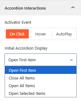
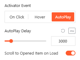
- Activator Event: Choose the trigger to open accordions: On Click or Hover.
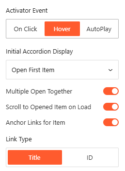
- Open First Item: Select it to open only the first accordion item, while keeping other items collapsed.
- Open Selected Item: Select it to set the number of accordion items you want to show on Click, while keeping other items collapsed.
- Scroll to Opened Item on Load: Enable this to automatically scroll the browser to the active item upon page entry.
- AutoPlay Delay: Define the duration in milliseconds between automatic panel transitions when AutoPlay is active.
- Anchor Links for Item: Enable it to generate unique URLs based on the Title or ID to link directly to specific panels.
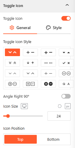
Toggle Icon: General
Note: This panel is only available if you select Template One.
From the Toggle Icon panel, you can customize the appearance, behavior, and positioning of the icons that indicate whether an accordion item is expanded or collapsed.
- Toggle Icon Style: Select from various icon pairs, like arrows or plus/minus signs, for open and closed states.
- Angle Right 90°: Toggle this to rotate the icon when the accordion panel is active.
- Icon Size: Use the responsive slider to set the icon’s pixel size across different devices.
- Icon Position: Set the toggle icon to appear at the Start or End of the header.
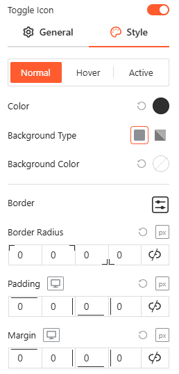
Style Toggle Icon:
Customize the colors, background types, borders, and spacing of your icons for Normal, Hover, and Active states from here.
Product Title: General
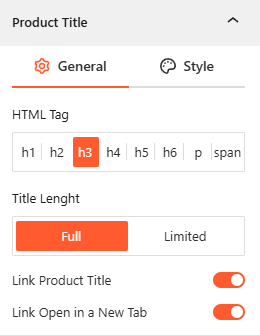
- Product Title: Enable this toggle to display the product names and choose the correct HTML Tag (h1–span) to maintain proper page hierarchy.
- Title Length: Choose to display the Full title or set a Limited character count to keep your layout uniform.
- Smart Linking: Enable Link Product Title to direct users to the product page, and choose if links should open in a New Tab.
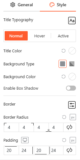
- Style Product Title: From this panel, you can customize the Title typography, colors, background, border, and spacing as needed.
Note: To configure the Product Meta, please go to the Product Content panel.
Product Image: General
From this panel, you can easily configure the product images’ size, scale, and position to create a visually engaging product layout.
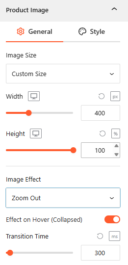
- Show/Hide Product Image: Enable this toggle to show the product image. (Only for Template One).
- Image Size: Select from image sizes or use Custom Size to define specific dimensions.
- Width & Height: Set the exact Width and Height of your images.
- Image to Description Gap: Set the Gap between the Image & Description from here (Only for Template One).
- Image Effect: Choose an animation style, such as Zoom Out, to apply to the product image.
- Effect on Hover (Collapsed): Toggle this to enable visual effects when a user hovers over a collapsed accordion panel.
- Transition Time: Set the speed of the image animation in milliseconds (e.g., 300ms).
Style Product Image:
From this panel, you can define the aesthetic presentation of your images with precise scaling and border controls.
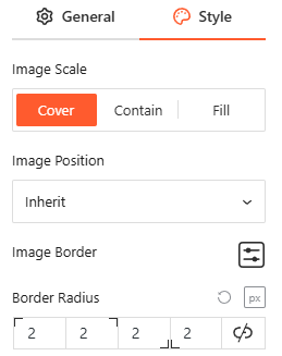
- Image Scale: Choose how the image fits its container using Cover, Contain, or Fill.
- Image Position: Use the dropdown to set the focal point of the image (e.g., Inherit).
- Image Border & Radius: Set the image border style & radius from here to match your brand’s design.
Product Meta: General
From the Product Meta panel, you can choose which specific details to display alongside your posts to provide better context for your readers.
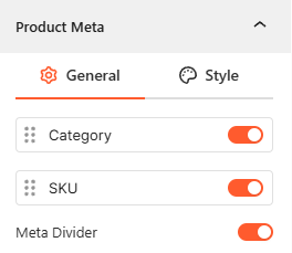
- Meta Selection: Toggle the visibility for the product Category and SKU.
- Meta Divider: Toggle this on to enable a divider between Category & SKU.
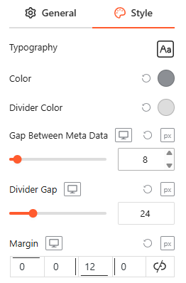
Style Product Meta:
From this panel, you can customize the product metadata Typography, Colors, Divider Color, Gap Between Metadata, and Margin to ensure a clean and readable design.
Product Content: General
From this panel, you can control the structural details of your product information to optimize for both SEO and user experience.
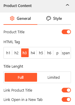
- Product Title: Enable this toggle to display the product names and choose the correct HTML Tag (h1–span) to maintain proper page hierarchy.
- Title Length: Choose to display the Full title or set a Limited character count to keep your layout uniform.
- Smart Linking: Enable Link Product Title to direct users to the product page, and choose if links should open in a New Tab.
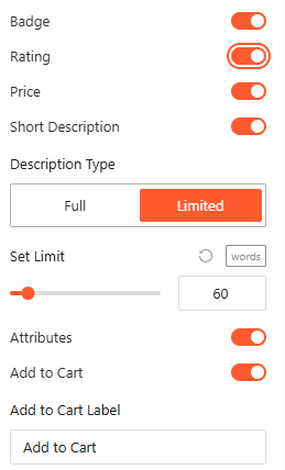
- Product Details: Use simple toggles to show or hide the Badge, Rating, Price, and Attributes.
- Short Description: Enable this toggle to show a short description and set a specific Word Limit (e.g., 60 words) as you wish.
- Add to Cart: Enable this toggle to activate the Add to Cart button and customize the Add to Cart Label to drive conversions.
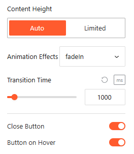
- Close Button: Toggle this on to add a dedicated button inside the expanded area for manual collapsing.
- Button on Hover: Enable this to make the close button visible only when the user hovers over the content area.
- Content Height & Animation: Customize content Height as Auto or Limited, choose an Animation Style, and set the Animation Delay from here.
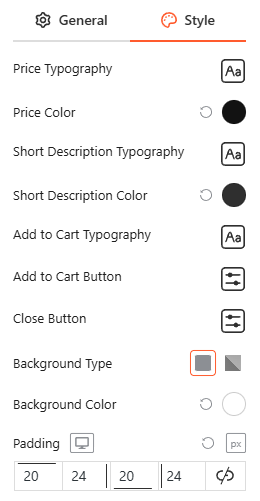
Style Product Content:
From this panel, you can customize the typography, colors, and spacing for Title, Short Description, Add to Cart Button, and the close button to ensure a cohesive and interactive content area.
Motion Effects:
From the Motion Effects panel, you can add animations and interactive movement to your accordion, making the content feel more dynamic as users scroll or interact.
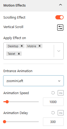
- Enable Scrolling Effects: Use this toggle to enable or disable scroll-based interactions.
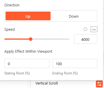
- Vertical Scroll: Use this to set how the animation will appear. Set the Direction (Up/down), speed, and apply the effect within the viewport.
- Apply Effect ON: Set the devices, such as Desktop, Tablet, or Mobile, to apply the effect on.
- Entrance Animation: Choose how the accordion appears when it enters the viewport, such as Fade In, Slide Up, Zoom In, or Bounce.
- Animation Speed & Delay: Set the Animation Speed & Adjust Animation Delay in milliseconds from here.
Advanced Settings:
The Advanced panel allows you to manage the overall container of the accordion, covering visibility, accessibility, and high-level styling.
General:
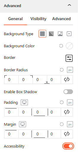
- Background & Border: Set the background type (Solid, Gradient, Image, or Video), border-radius, and box shadows for the main block container.
- Spacing: Define the precise Padding and Margin (in px) for the entire accordion structure.
- Accessibility: Enable this toggle to ensure the accordion follows standard web accessibility guidelines for screen readers and keyboard navigation.
Visibility:
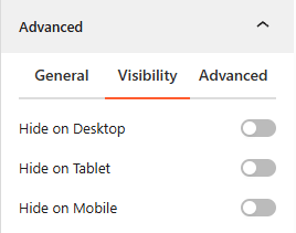
- Device Hiding: Toggle visibility on or off to hide the entire accordion block on Desktop, Tablet, or Mobile viewports for better responsive control.
Advanced:
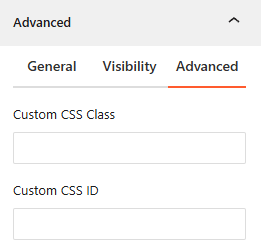
- Custom CSS: Apply a unique Custom CSS Class or Custom CSS ID to the block for deep styling or advanced developer hooks.
Congratulations! Let’s watch a live demo of how your Product Accordion 01 will look.