
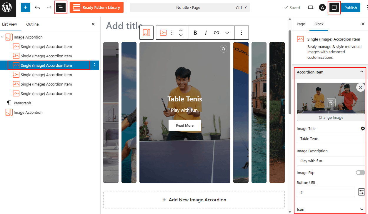
The Single (Image) Accordion Item is the specialized building block for your image-based accordion. Selecting this individual item allows you to manage and style specific images, titles, and descriptions with advanced customizations independent of the other items in the block.
How to Customize a Single Image Accordion Item:
- Choose Accordion Block: Choose your desired Image-Based Accordion Block.
- Select Item: Click directly on the individual accordion block you wish to edit.
- Access Sidebar: In the right-hand Block Settings sidebar, you will see a dedicated block to customize single-image items.
- Apply Changes: Customize as you wish and Save/Publish the block.
Single (Image) Accordion Item: General
From this panel, you can manage the core content, interactive behavior, and additional media for each accordion item:
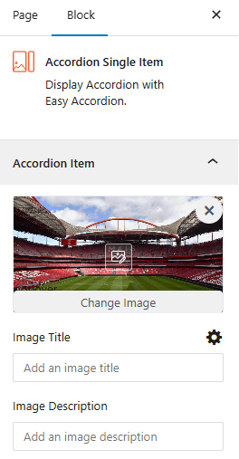
- Upload Image: Upload or change the primary image and access specific Collapsed or Expanded styling options, such as setting the Image Scale to Cover, Contain & Fill by clicking the styling icon.
- Image Title: Enter a custom title to identify the specific image within the accordion item.
- Image Description: Provide a short, descriptive text to appear alongside your image.
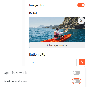
- Image Flip: Enable this toggle to add a secondary image that displays when a user interacts with the item.
- Button URL: Enter a destination web address and configure advanced link settings like Open in New Tab or mark as Nofollow.
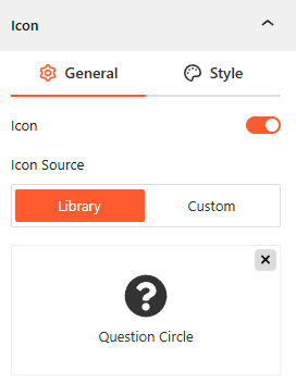
Icon: General:
- Show/Hide Icon: Toggle this on to enable or disable icons for the single item.
- Icon Source: Add an icon from the Library or upload a Custom icon for the accordion item.
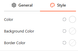
Icon Style:
From this panel, you easily set the specific Color, Background Color, and Border Color for your item icon.
Advanced:
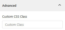
- Custom CSS: Apply a unique Custom CSS Class to the block for deep styling or advanced developer hooks.