
Display your blog posts dynamically with the Post Accordion 01 Block, where panels expand to reveal post titles, meta-details, and excerpts. Choose from horizontal or vertical layouts, filter posts with the advanced Query Builder, and enhance your feed with built-in search, FAQ Schema, AJAX Pagination, and full customizations as your brand needs.
Explore Ready Post Accordion Patterns →
How to Add the Post Accordion 01 Block:
To integrate the Post Accordion 01 block into your layout, follow these steps:
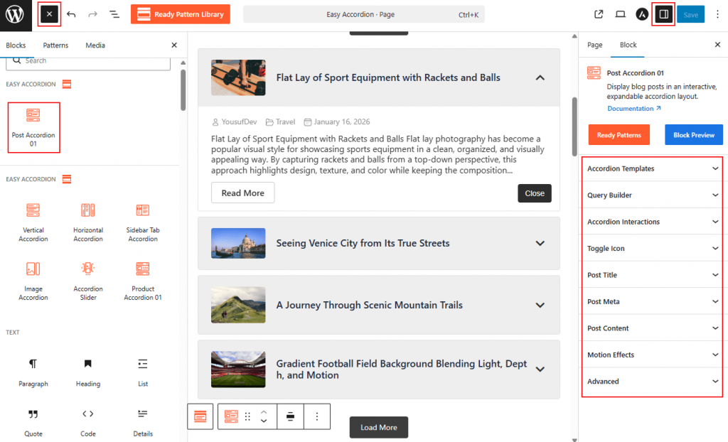
- Go to your WordPress Dashboard.
- Navigate to Pages> Add New (or edit an existing page).
- In the block editor, click the “+” (Add Block) button.
- Search for “Post Accordion 01” under the Easy Accordion category.
- Click to insert the block into your page.
How to Customize the Post Accordion 01 Block:
Using Post Accordion 01, you can automate your content display and tailor every visual detail. Use the settings below to configure your block:
- Dynamic Layouts: Select from multiple Accordion Templates and choose between Horizontal or Vertical orientations.
- Flexible Query Builder: Use the Query Builder to automatically pull posts by category, tag, or date.
- Smart Interactions: Define how panels open via Click, Hover, or AutoPlay, and enable Ajax Pagination for smooth browsing.
- Comprehensive Styling: Fully customize the typography, colors, and backgrounds for titles, metadata, excerpts, and buttons.
Now, let’s explore the detailed Settings & Stylings:
Accordion Templates: General
From this panel, you can select the visual structure and layout orientation to define how your blog posts are displayed within the accordion.
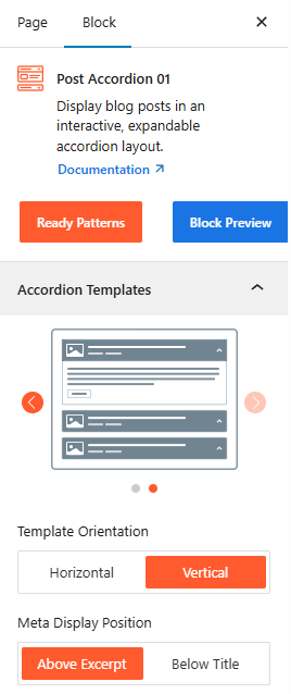
- Template Selection: Choose from a variety of visual presets to determine the base design of your post accordion.
- Template Orientation: Set the layout to either Horizontal or Vertical to best utilize your page’s space.
- Meta Display Position: Choose to place post meta-information either above the excerpt or below the title to establish a clear content hierarchy.
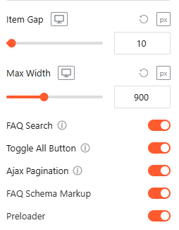
- Item Gap (Accordion): Adjust the vertical or horizontal spacing between individual accordion panels.
- Max Width: Set a maximum width for the entire accordion container to ensure it fits perfectly within your page layout.
Advanced Utilities:
- FAQ Search: Toggle this On/Off to enable instant FAQ filtering with advanced features. For details, visit here.
- Toggle All Button: Turn this On/Off, allowing the user to expand or collapse all panels at once. For details, visit here.
- AJAX Pagination: Turn this on to load accordion items dynamically, keeping page speed high. For details, visit here.
- FAQ Schema Markup: Automatically apply structured data to your content to improve visibility in search engine results.
- Preloader: Toggle on a smooth loading animation that displays while the block’s content is being fetched.
Post Query Builder:
From this panel, you can define the specific logic and criteria used to automatically fetch and display your posts within the accordion.
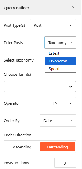
- Post Source Types: Select which types of content you want to show, such as Post, Page, Media, or Custom FAQs.
- Filter Posts: Choose your filtering method from options like Latest, Taxonomy, or a specific post you want to display.
- Order By & Direction: Organize your Posts by Date, Title, or other metrics, and set the display sequence to Ascending or Descending.
- Posts To Show: Enter the exact number of posts you want to appear within the accordion block.
Taxonomy Filter: General
From this panel, you can manage how posts are categorized on the frontend for easier user navigation.
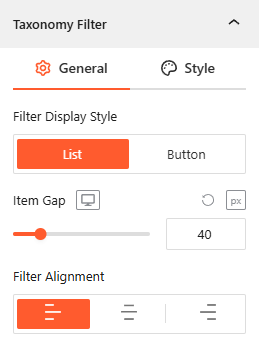
- Filter Display Style: Choose between a List or Button layout to show post categories for user filtering.
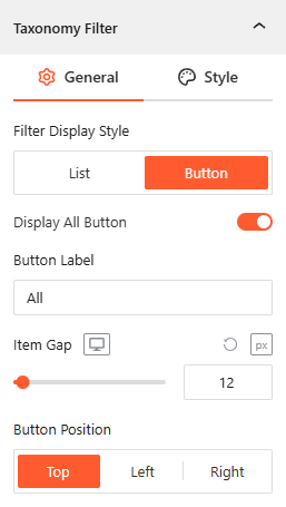
- Display All Button: If you prefer filter display style as the Button, enable this toggle to show the Display All Button text button and customize the Button Label (e.g., “All” or “Everything”).
- Item Gap: Set the exact pixel spacing between individual filter items.
- Filter Alignment: Justify the taxonomy filter menu to the Left, Center, or Right of the block.
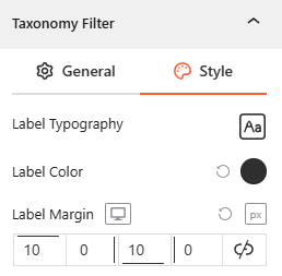
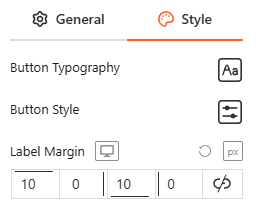
Style Taxonomy Filter:
- Customize the Label & Button Typography, Label Color, and Label Margin to ensure the filter matches your brand’s aesthetic.
Accordion Interactions:
From this panel, you can define the behavioral triggers and initial display states to ensure a smooth, interactive experience for your visitors.
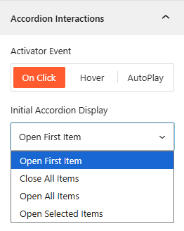
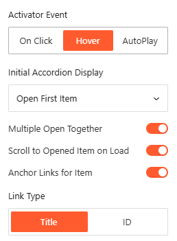
- Activator Event: Choose the trigger to open accordions: On Click, Hover, or AutoPlay.
- Initial Accordion Display: Set the default state on page load, such as Open First, Close All, Open All, or Open Selected.
- Multiple Open Together: Toggle this on to allow several accordion panels to remain expanded simultaneously.
- AutoPlay Delay: Define the duration in milliseconds between automatic panel transitions when AutoPlay is active.
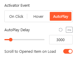
- Scroll to Opened Item on Load: Enable this to automatically scroll the browser to the active item upon page entry.
- Anchor Links for Item: Enable it to generate unique URLs based on the Title or ID to link directly to specific panels.
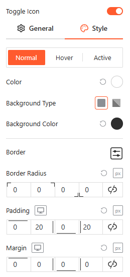
Toggle Icon: General
From the Toggle Icon panel, you can customize the appearance, behavior, and positioning of the icons that indicate whether an accordion item is expanded or collapsed.
- Toggle Icon Style: Select from various icon pairs, like arrows or plus/minus signs, for open and closed states.
- Angle Right 90°: Toggle this to rotate the icon when the accordion panel is active.
- Icon Size: Use the responsive slider to set the icon’s pixel size across different devices.
- Icon Position: Set the toggle icon to appear at the Start or End of the header.
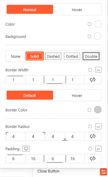
Style Toggle Icon:
Customize the colors, background types, borders, and spacing of your icons for Normal, Hover, and Active states from here.
Post Title: General
From the Post Title panel, you can manage the structural tags, featured image, titles, and link behaviors for your post headers to ensure optimal SEO and user navigation.
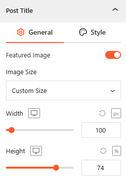
- Featured Image: Use this toggle to show or hide the post’s featured image within the title area.
- Image Size: Set a Custom Size and use the responsive sliders to define the exact Width and Height for the featured image.
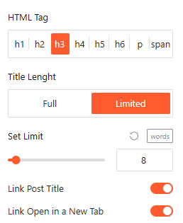
- HTML Tag: Select the appropriate heading tag (from h1 to span) to maintain a correct SEO structure for your post titles.
- Title Length: Choose between Full or Limited display modes; if limited, use the slider to set a specific maximum word count.
- Link Post Title: Enable this toggle to make the title clickable, with an additional option to Link Open in a New Tab.
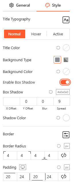
Style Post Title:
From this panel, you can customize the typography, colors, background, and spacing for your post titles across various interaction states to ensure a cohesive brand appearance.
Post Meta: General
From the Post Meta panel, you can choose which specific details to display alongside your posts to provide better context for your readers.
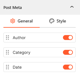
- Meta Selection: Toggle the visibility for the post Author, Category, and Date.
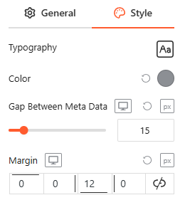
Style Post Meta:
From this panel, you can customize the typography, colors, and layout spacing for your post metadata to ensure a clean and readable design.
Post Content: General
From the Content panel, you can manage the expanded area of your accordion by configuring the post summary, action buttons, and visual animations for a dynamic reading experience.
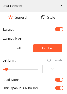
Post Excerpt:
From this panel, you can control the visibility and length of the post excerpt to ensure your accordion panels remain clean and concise.
- Enable Excerpt: Toggle this option on or off to show or hide the post summary text.
- Excerpt Length: Set the display mode to Limited and use the slider to define the exact number of words shown.
Read More Button:
From the Read More panel, you can configure the call-to-action button that directs users to the full blog post.
- Enable Read More: Toggle this on to display a “Read More” button for each post.
- Link Open in New Tab: Enable it to enable the Posts Link to open in a New Tab.
From the Content panel, you can control the height, visibility, and animation of your accordion’s expanded area to ensure your answers are presented clearly.
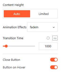
- Content Height: Select Auto for natural expansion or Limit to set a specific maximum height for the content area.
- Animation Effects: Choose visual effects from 10 more styles for the content when it expands to create a more dynamic feel.
- Animation Delay: Define the autoplay time (in ms) before the opening animation begins.
- Close Button: Toggle this on to add a dedicated button inside the expanded area for manual collapsing.
- Button on Hover: Enable this to make the close button visible only when the user hovers over the content area.
Style Post Content:
From this panel, you can customize the typography, colors, and layout spacing for both the excerpt text and the read more button to ensure a cohesive and interactive content area.
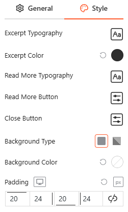
- Excerpt Typography & Color: Define the specific font settings and text color for your post summaries.
- Button Appearance: Configure the Close & Read more button’s background, border radius, and hover effects to create a distinct call-to-action.
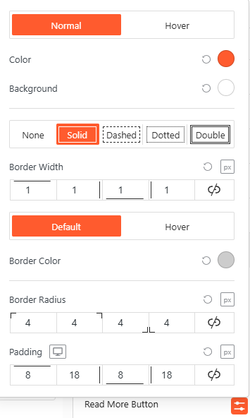
- Spacing & Alignment: Adjust the internal padding and external margins for both the excerpt and the button to refine the overall layout.
Motion Effects:
From the Motion Effects panel, you can add animations and interactive movement to your accordion, making the content feel more dynamic as users scroll or interact.
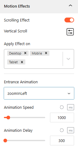
- Enable Scrolling Effects: Use this toggle to enable or disable scroll-based interactions.
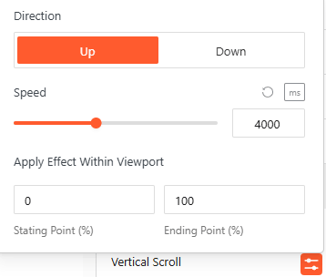
- Vertical Scroll: Use this to set how the animation will appear. Set the Direction (Up/down), speed, and apply the effect within the viewport.
- Apply Effect ON: Set the devices, such as Desktop, Tablet, or Mobile, to apply the effect on.
- Entrance Animation: Choose how the accordion appears when it enters the viewport, such as Fade In, Slide Up, Zoom In, or Bounce.
- Animation Speed & Delay: Set the Animation Speed & Adjust Animation Delay in milliseconds from here.
Advanced Settings:
The Advanced panel allows you to manage the overall container of the accordion, covering visibility, accessibility, and high-level styling.
General:
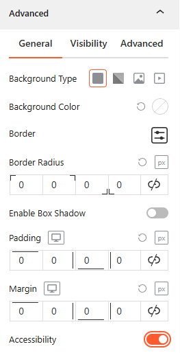
- Background & Border: Set the background type (Solid, Gradient, Image, or Video), border-radius, and box shadows for the main block container.
- Spacing: Define the precise Padding and Margin (in px) for the entire accordion structure.
- Accessibility: Enable this toggle to ensure the accordion follows standard web accessibility guidelines for screen readers and keyboard navigation.
Visibility:
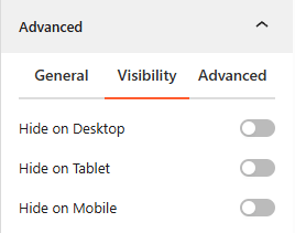
- Device Hiding: Toggle visibility on or off to hide the entire accordion block on Desktop, Tablet, or Mobile viewports for better responsive control.
Advanced:
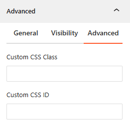
- Custom CSS: Apply a unique Custom CSS Class or Custom CSS ID to the block for deep styling or advanced developer hooks.
Congratulations! Let’s watch a live demo of how your Post Accordion 01 will look.