Display your accordion content with images or media in a side-by-side layout with the Media Accordion block. This block is designed to present your accordion content with high-quality visuals effectively, which captures user attention. Enhance your content presentation with SEO-ready FAQ schema, smooth animations, and full customization to match your needs.
Explore Ready Media Accordion Patterns →
How to Add the Media Accordion Block:
- Go to your WordPress Dashboard.
- Navigate to Pages > Add New (or edit an existing page).
- Click the “+” (Add Block) button in the block editor.
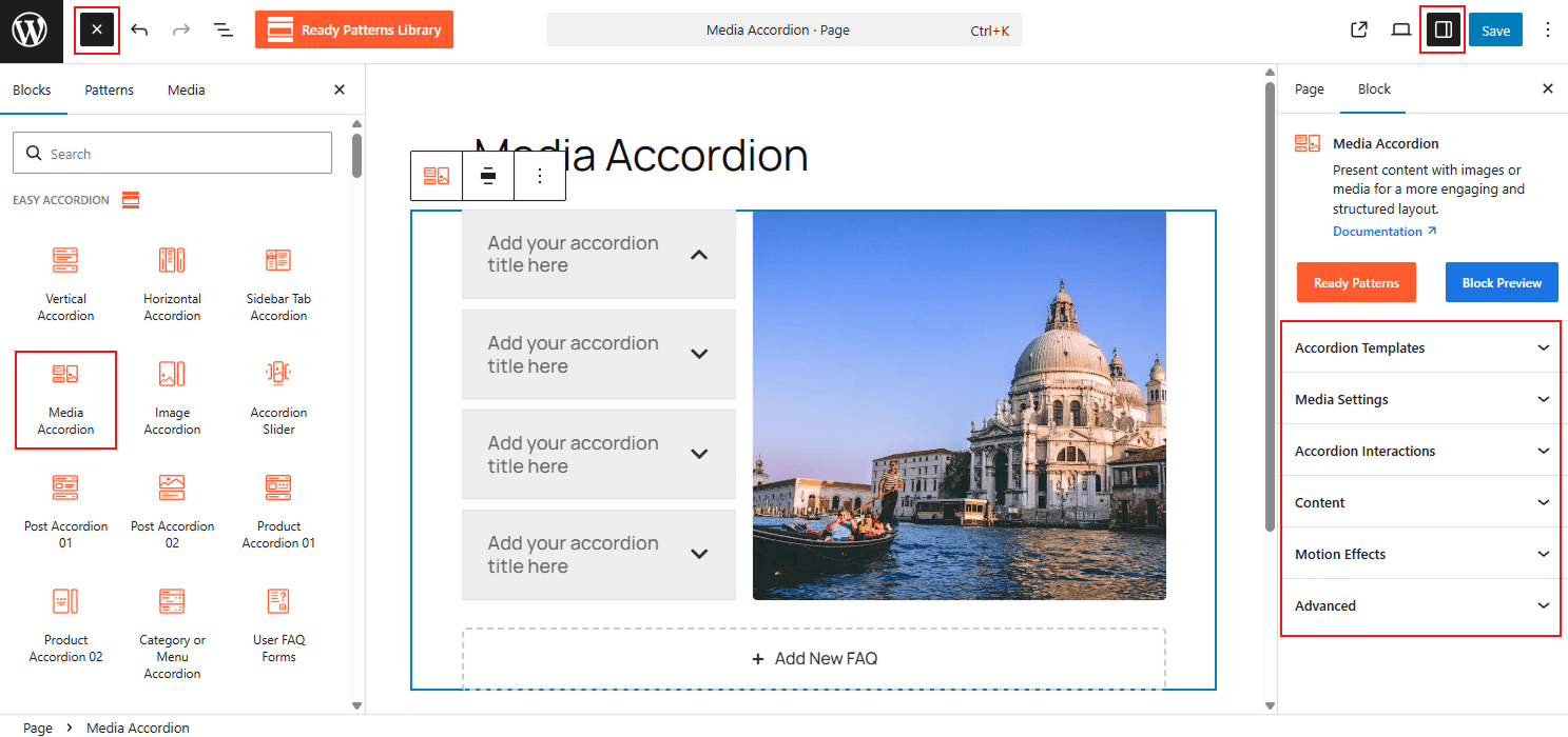
- Search for “Media Accordion” under the Easy Accordion category.
- Insert the block into your page.
How to Customize Media Accordion Block:
Display images or media in a structured, collapsible layout for enhanced visual appeal. Follow the steps below to add unlimited items and customize the styling for a more engaging presentation.
- Add Unlimited Items: Use the “+ Add New Accordion” button to insert unlimited accordion items into your block.
- Upload Media: Upload images from your Media Gallery and customize them as needed.
- Easy Controls: Define which items stay open by default and manage toggle triggers, such as Click or Mouseover, to control user interaction.
- Enhance Headers: Add unique icons and titles to each item to improve visual hierarchy and navigation.
- Full Styling: Customize typography, colors, and gaps (like Item Gap and Title to Content Gap) to ensure a seamless brand fit.
N.B: You can also easily customize and add style to each single accordion item as you wish. For details, visit here.
Now, let’s explore the detailed Settings & Stylings:
Accordion Template:
From this panel, you will be able to define the core structure of your accordion and other configurations:
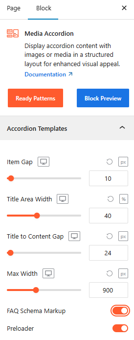
- Item Gap: Adjust the Item Gap to set the spacing between individual accordion items.
- Title Area Width: Set the Title Area Width to control how much horizontal space the titles occupy.
- Title to Content: Adjust the Title to Content Gap as needed from here.
- Max Width: Adjust the Max Width to ensure the accordion fits perfectly within your page container.
- FAQ Schema Markup: Toggle it ON, located right after the templates, to ensure your content is search-engine friendly. For more details, please visit here.
- Preloader: Toggle on a smooth loading animation that displays while the block’s content is being fetched.
Media Settings:
Navigate to the Media Settings panel to control the visual relationship between content and media:
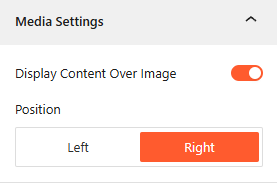
- Display Content Over Image: Toggle it ON to Display Content Over Image if you want your text to overlay the media background.
- Media Position: Select the Position (Left or Right) to determine which side the media appears relative to your content.
Accordion Interactions:
From this panel, you can define the behavioral triggers and initial display states to ensure a smooth, interactive experience for your visitors. For more details, please visit here.
Content:
From the Content panel, you can control the expanded area of your accordion by adjusting the length, and you can add visual animations for a dynamic reading experience. For more details, please visit here.
Motion Effects:
From the Motion Effects panel, you can add animations and interactive movement to your accordion, making the content feel more dynamic as users scroll or interact. For more details, please visit here.
Advanced Settings:
The Advanced panel allows you to manage the overall container of the accordion, covering visibility, accessibility, and high-level styling. For more details, please visit here.