
Simplify your post categories, WooCommerce product brands, and WordPress or any custom menus with the customizable Category or Menu Accordion block. It is designed to streamline complex taxonomies or menus into a clean, collapsible interface, allowing users to explore your content without overwhelming the page layout.
Explore Ready Category Accordion Patterns →
How to Add the Category or Menu Accordion Block:
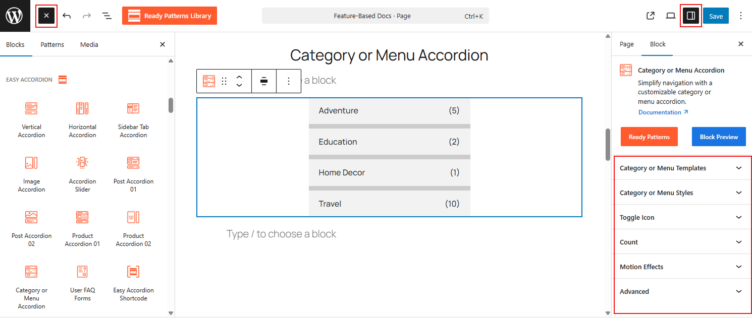
- Open your WordPress Dashboard.
- Navigate to Pages and click Add New or edit an existing page.
- Click the (+) icon and search for Category or Menu Accordion.
- Select the block to insert it into your editor.
How to Customize the Category or Menu Accordion Block:
Using the Category or Menu Accordion, you can automate your navigation display and tailor every visual detail. Use the settings below to configure your block:
- Beautiful Layouts: Select from three Accordion Templates and choose the right layout as you need.
- Multiple Data Sources: Toggle between Taxonomy or Menu sources to automatically pull categories, tags, brands, or existing WordPress menus.
- Intuitive Filtering: Refine your list by showing all items, selecting specific terms, or excluding categories to keep navigation relevant.
- Structured Hierarchy: Manage visual depth and sorting, from simple parent-only views to complex multi-level submenus.
- Comprehensive Styling: Fully customize typography, colors, and backgrounds for parent items, child items, and numerical counters.
Now, let’s explore the detailed Settings & Stylings:
Category or Menu Templates:
Choose the right templates and adjust the spacing for your accordion:
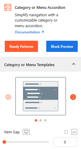
- Template Selection: Select from professionally designed layouts to match your site’s aesthetic.
- Item Gap: Set the vertical spacing between individual categories or menu items.
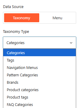
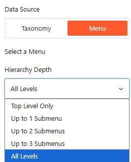
Data Source Type (Taxonomy & Menu):
Select where your accordion pulls its information from:
- Data Source: Toggle between Taxonomy (for categories, tags, brands) or Menu (for existing WordPress navigation menus).
Source By Taxonomy:
Select the specific taxonomy to display, such as Categories, Tags, Navigation Menus, Brands, or Product Categories.
Categories to Show (Filter):
Using this, you can refine which items appear in your accordion.
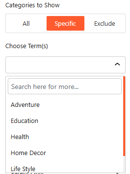
- Filter Mode: Choose to show all items, select Specific terms to include, or exclude certain categories from the list.
- Choose Term(s): Use the search bar to find and select the specific categories or tags you wish to display.
Taxonomy/ Menu Ordering & Hierarchy:
Manage the structure and sequence of your accordion Category or Menu items.
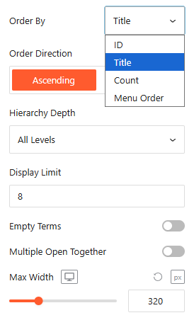
- Order By: Sort your items by ID, Title, Count (number of posts), or Menu Order.
- Order Direction: Choose between Ascending or Descending.
- Display Limit: Set the maximum number of items to show.
- Empty Terms or Hashtag Link: Toggle this to show or hide categories or menus that contain no items.
- Multiple Open Together: Turn on/off this toggle to enable or disable multiple accordions to open together.
- Max Width: Set the Max Width of the accordion items, ensuring they fit well with all devices.
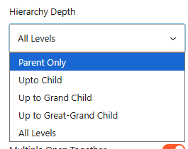
- Hierarchy Depth: Control how many levels of sub-items are shown for Menu (e.g., Top Level Only, Up to 2 Submenus, or All Levels) and Category (e.g., Parent Only, Up to Child, Up to Grand Child, Up to Great-Grand Child, or All Levels)
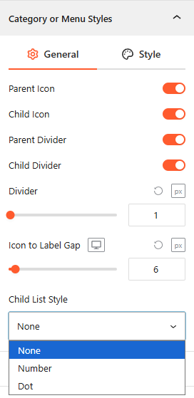
Category or Menu Styles (Icons & Dividers):
From this panel, you can easily customize the visibility of the structural elements of Category or Menu Styles.
- Parent/Child Icons: Toggle to enable or disable the visibility of icons next to parent and subcategory items.
- Dividers: Enable or disable horizontal lines between items.
- Divider & Gap: Adjust the divider thickness and the spacing between the icon and the text label.
- Child List Style: Choose a list indicator for sub-items, such as None, Number, or Dot.
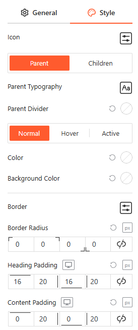
Style Category or Menu:
From this panel, you can customize the Typography, Colors, and Background Colors for both child and parent category items in various interaction states, while also adjusting Borders, Border Radius, and Padding to ensure brand consistency.
Toggle Icon:
From the Toggle Icon panel, you can customize the appearance, behavior, and positioning of the icons that indicate whether an accordion item is expanded or collapsed. For more details, please visit here.
Count: General
From this panel, you can easily customize the visibility and placement of the numerical indicators for your categories or menus.
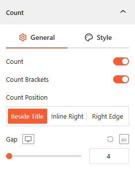
- Count: Toggle this on to display the total number of items (posts or products) within each category.
- Count Brackets: Enable or disable brackets around the numerical value (e.g., “(5)”).
- Count Position: Choose exactly where the count appears, such as beside the Title, inline right, or fixed to the Right Edge.
- Gap: Adjust the precise pixel spacing between the category label and the counter to ensure a clean layout.
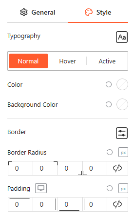
Style Count:
From this panel, you can customize the Typography, Color, and Background Color for Normal, Hover, and Active states, and adjust the Border Radius and Padding to create a distinct, badge-style look for your counters.
Motion Effects:
From the Motion Effects panel, you can add animations and interactive movement to your accordion, making the content feel more dynamic as users scroll or interact. For more details, please visit here.
Advanced Settings:
The Advanced panel allows you to manage the accordion’s overall container, covering visibility, accessibility, and high-level styling. For more details, please visit here.