
Display your visuals in an engaging, interactive accordion format. It is a great way to showcase portfolios, team members, or gallery highlights in a structured and space-saving layout that captures user attention.
Note: Since WordPress upgraded from classic to Gutenberg, you can try our newly added drag and drop FAQs & Accordion blocks with a ready-to-use Pattern Library.
Steps to Create an Image Accordion:
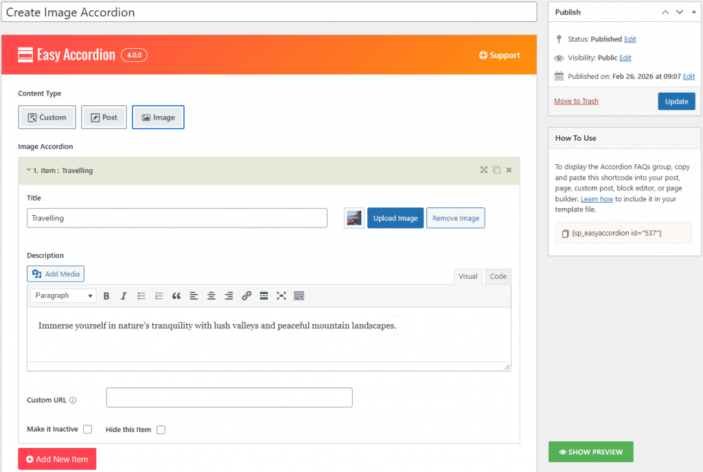
- Select Content Type: Choose the Image content source to begin building a visually-driven accordion.
- Add Accordion Items. Enter a Title and Description for your item, then click Upload Image to add your featured visual. You can also add a Custom URL to make the item clickable.
- Choose Layout Preset. Navigate to Accordion Settings and select your preferred orientation: Horizontal or Vertical.
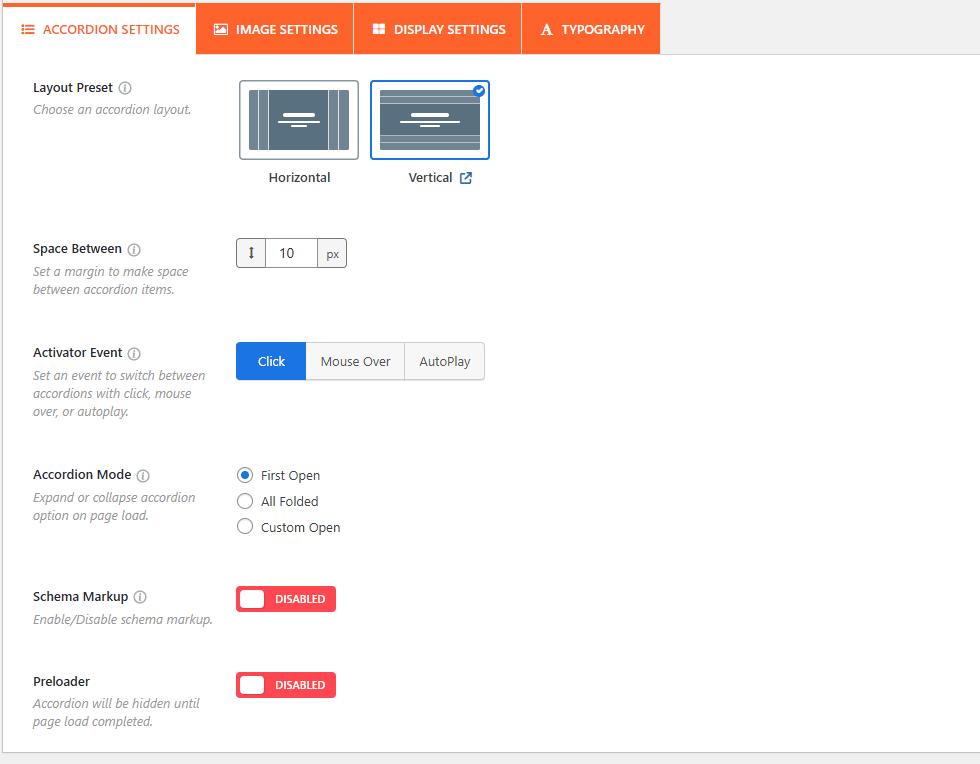
Configure Interaction: Set the Space Between (px) to define margins and select an Activator Event (Click, Mouse Over, or AutoPlay) to determine how the accordion responds to users.
Customize Image Settings:
Go to the Image Settings tab to set the Maximum Height for Desktop and Mobile.
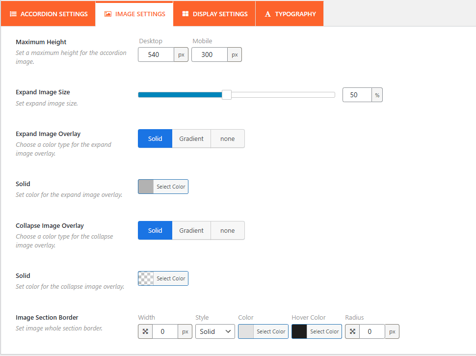
- Adjust the Expand Image Size (%) and choose Solid or Gradient overlays for both expanded and collapsed states.
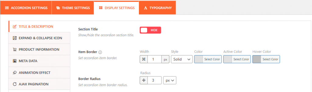
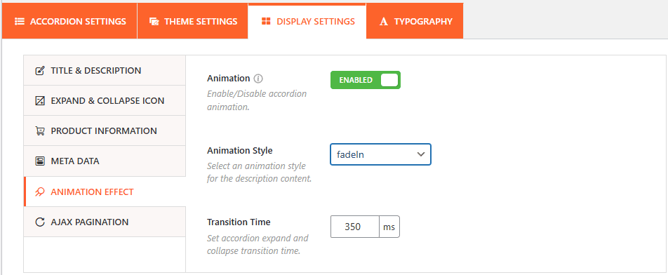
- In Display Settings, you can toggle the Section Title, customize Item Borders, and enable Animation Effects.
- Select an Animation Style (like fadeIn) and set the Transition Time in milliseconds.
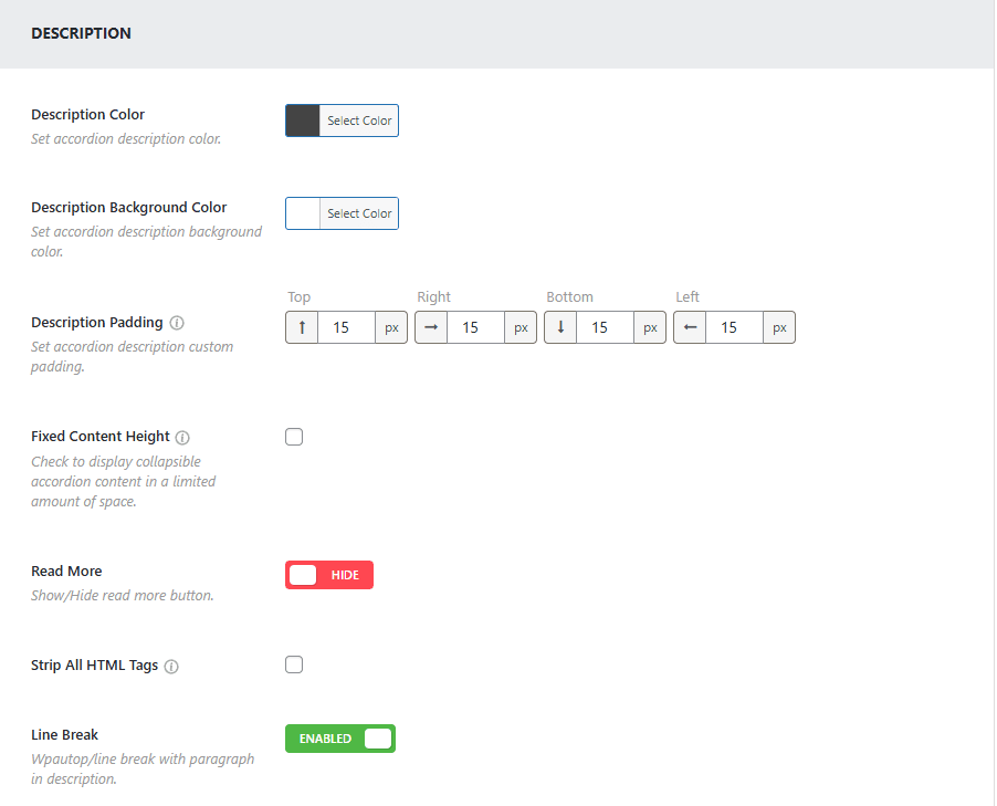
- Fine-tune the look by setting the Description Color, Background Color, and Padding. You can also enable Line Breaks or use a Read More button for longer content.
Publish the Image Accordion:
After configuring your Image Accordion:
- Click Publish or Update.
- Copy the generated Shortcode (e.g., [sp_easyaccordion id=”537″]).
- Paste the shortcode into any page, post, or widget area where you want the visual accordion to appear.
Your images will now be displayed as a fully functional, interactive Image Accordion on the frontend.