
The Accordion Single Item is the core building block of any FAQ or Accordion Block. Selecting an individual item allows you to customize its specific behavior, content structure, and style independently from the rest of the accordions for your selected accordion block.
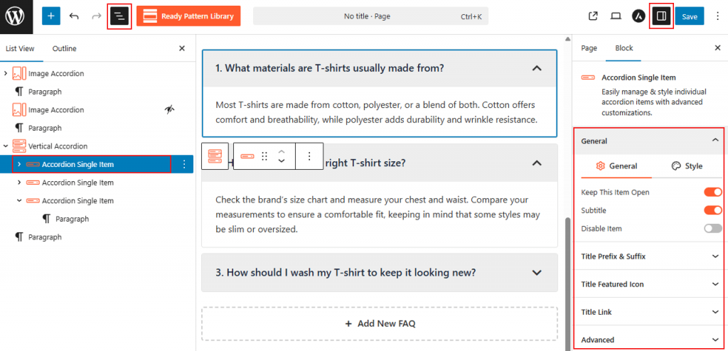
How to Customize a Single Accordion Item:
- Choose Accordion Block: Choose your desired FAQ Based Accordion Block.
- Select Item: Click directly on the individual accordion block you wish to edit.
- Access Sidebar: In the right-hand Block Settings sidebar, you will see a dedicated block to customize single-image items.
- Apply Changes: Customize as needed, then Save/Publish the block.
Accordion Single Item: General
From this panel, you can easily control the functional behavior and structural elements of a specific accordion item:
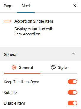
- Keep This Item Open: Enable this toggle if you want this specific item to be expanded by default when the page loads.
- Subtitle: Toggle this on to add a subtitle below the main accordion title.
- Disable Item: Use this toggle to disable any specific accordion items you want to hide temporarily. It will remain in your editor but will be hidden or non-interactive for site visitors.
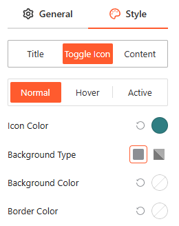
Style Accordion Single Item:
The Style panel allows you to customize the appearance of individual item components across Normal, Hover, and Active states:
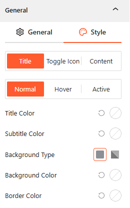
- Title: Customize the Title Color, Subtitle Color, Background Type (Solid or Gradient), and Border Color for the header area.
- Toggle Icon: Adjust the Icon Color, Background Color, and Border Color to make the expansion trigger stand out.
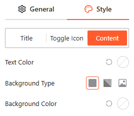
- Content: Manage the Text Color and Background Type (including Solid, Gradient, or Image) for the expanded content area.
Title Prefix & Suffix: General
From this panel, you can easily add or hide Title Prefix & Suffix as you need.
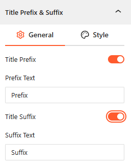
- Title Prefix: Enable this toggle to add custom text before the accordion title.
- Title Suffix: Enable this toggle to add custom text after the accordion title.
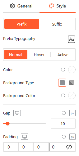
Style Title Prefix & Suffix:
From this panel, you can customize the typography, color, background, and spacing for your prefixes and suffixes to ensure they perfectly match your brand.
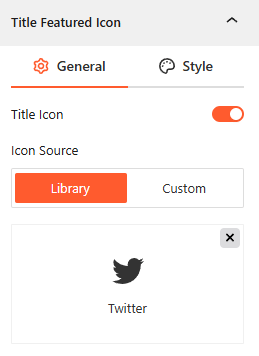
Title Featured Icon: General
From this panel, you can add a specialized icon to the title area to visually distinguish or brand individual accordion items:
- Title Icon: Enable this toggle to display a featured icon alongside your accordion title.
- Icon Source: Choose a graphic from the built-in icon Library or upload a Custom image to use as your featured icon.
Style Title Featured Icon:
From this panel, you can customize the icon’s color across Normal, Hover, and Active states to ensure it remains visible and on-brand.
Title Link: General
From this panel, you can configure a functional link directly within the accordion title area:
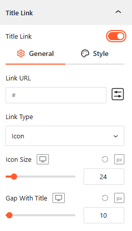
- Title Link: Toggle this on to enable a clickable link for this specific accordion item.
- Link URL: Enter the destination web address where you want users to be directed upon clicking.
- Link Type: Select how the link is displayed, such as using an Icon.
- Icon Size: Adjust the scale of the link icon for different devices.
- Gap With Title: Set horizontal space between the accordion title and the link element.
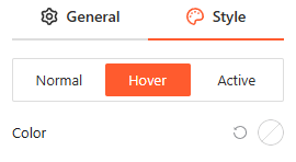
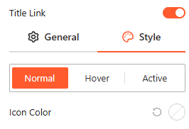
Style Title Link:
From this panel, you can customize the title link color across Normal, Hover, and Active states to ensure it remains visible and on-brand.
Advanced:
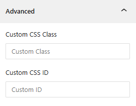
- Custom CSS: Apply a unique Custom CSS Class or Custom CSS ID to the block for deep styling or advanced developer hooks.