
Allow your visitors to submit questions & collect them directly through your website using the highly customizable User FAQ Form block. This FAQ form builder is designed to collect your business and community inquiries, manage them efficiently, and improve your site’s engagement by turning user concerns into helpful FAQ content.
Explore Ready User FAQ Forms Patterns →
How to Add the User FAQ Form Block:
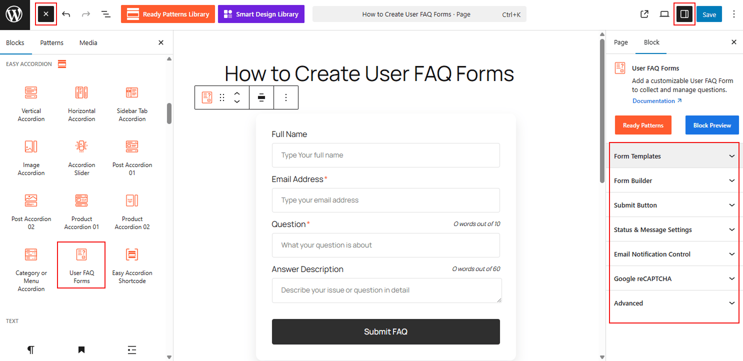
- Open your WordPress Dashboard.
- Navigate to Pages or Posts and click Add New or edit an existing entry.
- Click the (+) icon and search for User FAQ Form.
- Select the block to insert it into your editor.
Watch this Video Tutorial to add a customizable FAQ Form easily:
How to Customize the User FAQ Form Block:
Using the User FAQ Form, you can streamline the question-collection process and tailor the form’s appearance to match your brand. Use the settings below to configure your block:
- Ready-to-Use Templates: Select from pre-designed Form Templates and layouts to get your submission form up and running in seconds.
- Flexible Display Types: Choose between an Inline form that sits directly on the page or a pop-up style that saves space and keeps your layout clean.
- Dynamic Styling: Fully customize the form’s background, border, and shadows, ensuring the submission interface feels like a native part of your design.
- Built-in Accessibility: Enable specialized accessibility features to ensure every user, regardless of ability, can easily interact with and submit the form.
Now, let’s explore the detailed Settings & Stylings:
Form Templates:
From this panel, you can choose the layout and structural behavior of your submission form.
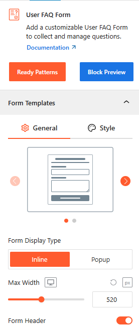
- Template Selection: Use the visual carousel to pick a pre-designed form template as you need.
- Form Display Type: Choose Inline to embed the form on the page or Popup to trigger it via a button or link.
Note: If the Popup display type is selected, you can manage how the form is accessed.
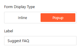
Popup Settings (Trigger & Label):
- Label: Customize the text for the trigger button, such as “Suggest FAQ” or “Ask a Question”.
- Popup Style: Configure the animation and appearance of the modal window when it is activated by the user.
- Max Width: Set the maximum width of the form container (e.g., 520px) to ensure it looks great on all screen sizes.
- Form Header: Toggle the visibility of the header section to include or remove introductory text.
Style Form Templates:
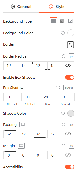
Stylings: From this panel, you can fully customize the form’s visual container by defining the Background Type, Border & Radius, and Box Shadow for depth, while adjusting Padding & Margin to ensure perfect spacing and a cohesive design within your layout.
Accessibility: Toggle the Accessibility switch to enable optimized labels and focus states for screen readers and keyboard navigation.
Form Builder:
From this panel, you can structure your submission form by adding and organizing essential fields to capture user inquiries effectively.
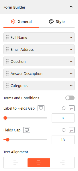
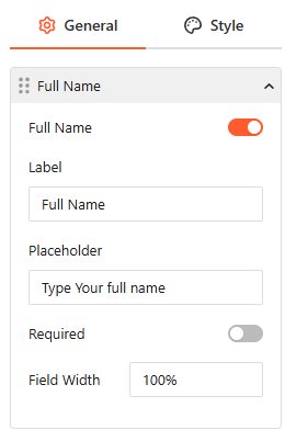
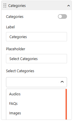
- Field Management: Toggle and reorder core fields such as Full Name, Email Address, Question, Answer Description, and Categories.
- Field Customization: For each field, you can set a custom Label, a descriptive Placeholder, and define the Field Width (e.g., 100%).
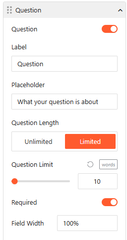
- Constraint Controls: Mark fields as Required and set specific Question Length limits (e.g., 10 words) to ensure concise submissions.
- Layout Spacing: Use the Label to Fields Gap and Fields Gap sliders to adjust pixel-perfect vertical spacing.
- Text Alignment: Choose between left, center, or right alignment for your form labels and input text.
Style Form Builder:
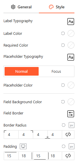
From this panel, you can fully customize the visual appearance of your form fields by defining Label & Placeholder Typography, Colors, and Field Backgrounds, while adjusting Border Radius and Padding for a modern, user-friendly interface.
Submit Button:
From this panel, you can define the call-to-action for your form by configuring the button’s core behavior and placement.
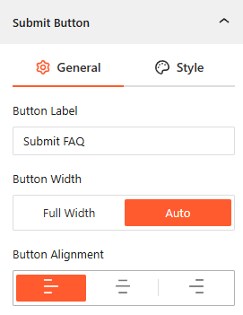
- Button Label: Enter custom text for the submission trigger, such as “Submit FAQ” or “Send Question”.
- Button Width: Choose between Full Width to span the entire form or Auto to size the button based on its content.
- Button Alignment: Set the button’s horizontal position to Left, Center, or Right to match your form’s layout.
Style Submit Button:
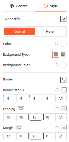
From this panel, you can fully customize the button’s visual identity by defining the Typography, Colors, and Background Type for both Normal and hover states, while adjusting the Border, Radius, Padding, and Margin for a high-impact design.
Status & Message Settings:
From this panel, you can manage how the form will handle user submissions and what feedback visitors receive after interacting with the form.
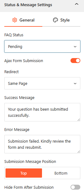
- FAQ Status: Set the default publishing status for new submissions, such as Pending, Private, Draft, or Auto Publish, to review questions before they go live.
- Ajax Form Submission: Toggle this on to allow users to submit questions without the page refreshing.
- Redirect: Choose whether to keep the user on the Same Page, to a New Page, or redirect them to a Custom URL after a successful submission.
- Success & Error Messages: Customize the exact text for both the Success Message (e.g., “Your question has been submitted successfully.”) and the Error Message (e.g., “Submission failed. Kindly review…”).
- Submission Message Position: Choose to display feedback messages at the Top or Bottom of the form.
- Hide Form After Submission: Enable this toggle to automatically remove the form from view once a user has successfully sent their inquiry.
Style Status & Message Settings:
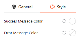
From this panel, you can customize the visual feedback of your form by defining specific Success Message Colors and Error Message Colors to ensure alerts are immediately recognizable to your users.
Email Notification Control:
From this panel, you can automate email alerts to keep both administrators and users informed throughout the submission and approval process.
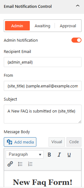
- Admin Notification: Enable this toggle to send an automatic email alert to the site administrator whenever a new FAQ is submitted.
- Awaiting FAQ Notification: Toggle this on to notify administrators specifically when a submitted question is held in the “Pending” status for review.
- User Approval Notification: Enable this to automatically notify the user via email once their submitted question has been approved and published.
- Email Customization: For each notification type, you can define a custom Email Subject and Email Body to ensure the messaging is clear and professional.
Google reCAPTCHA:
From this panel, you can protect your form from spam and automated submissions by integrating Google’s security services.
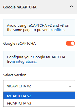
- Enable Google reCAPTCHA: Toggle this switch to activate bot protection during the FAQ collection process.
- Version Selection: Choose between reCAPTCHA v2 or reCAPTCHA v3 based on your security preferences.
- Integration Configuration: Use the provided link to configure your specific Google API keys within the plugin’s integrations settings.
Note: Ensure you do not use both v2 and v3 on the same page to prevent technical conflicts.
Advanced Settings:
The Advanced panel allows you to manage the accordion’s overall container, covering visibility, accessibility, and high-level styling. For more details, please visit here.