
Create and showcase interactive image sliders with the Accordion Slider Block, which expands images to reveal titles, descriptions, and buttons. Choose from stylish horizontal slider templates, and enhance your visuals with Smart Interactions, Autoplay, Navigation Arrows, Pagination Dots, smooth animations, and full customization to match your brand.
Explore Accordion Slider Patterns →
How to Add the Accordion Slider Block:
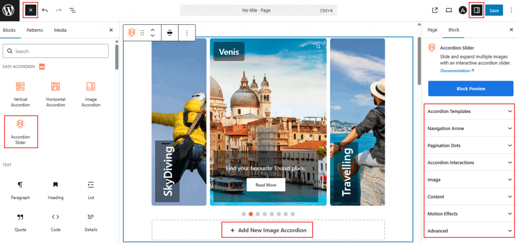
- Go to your WordPress Dashboard.
- Navigate to Pages > Add New (or edit an existing page).
- Click the “+” (Add Block) button in the block editor.
- Search for “Accordion Slider” under the Easy Accordion category.
- Insert the block into your page.
How to Customize Accordion Slider Block:
Build a dynamic image slider with full control over layout and design:
- Add Unlimited Images: Click “Add New Image Accordion” for more slider images.
- Slider Settings: Configure items to show, autoplay, slide speed, direction, and slides per scroll.
- Navigation Controls: Enable and style arrows and pagination dots.
- Enhanced Content: Display or hide titles, descriptions, buttons, and adjust typography, colors, spacing, overlays, and animations.
- Advanced Utilities: Enable preloader and motion effects for a polished, interactive experience.
N.B: You can also easily customize and add style to each single accordion item as you wish. For details, visit here.
Now, let’s explore the detailed Settings & Stylings:
Accordion Templates: General
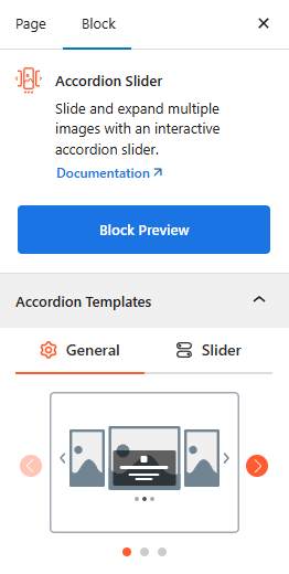
- Template Selection: Choose from a variety of pre-designed horizontal slider layouts to match your page’s visual style.
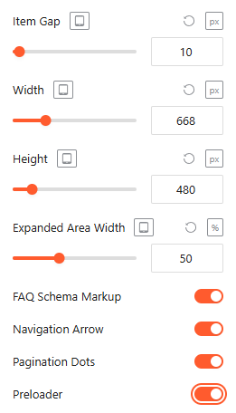
- Item Gap: Adjust the spacing (in pixels) between individual slider items to create a breathable or seamless look.
- Width & Height: Set the overall dimensions for the slider container with responsive controls for Desktop, Tablet, and Mobile.
- Expanded Area Width: Define how much space (in percentage) an item occupies when it is active or expanded.
Advanced Utilities:
- FAQ Schema Markup: Enable this toggle to automatically apply structured data, making your slider content more visible to search engines. For more details, please visit here.
- Navigation Arrow: Toggle the display of directional arrows to allow users to manually slide through items. For more details, please visit here.
- Pagination Dots: Enable or disable the dot indicators at the bottom of the slider to show current progress. For more details, please visit here.
- Preloader: Enable a smooth loading animation to ensure a polished experience while the slider assets are being fetched.
Accordion Templates: Slider
The Slider tab allows you to control the movement, timing, and flow of your content:
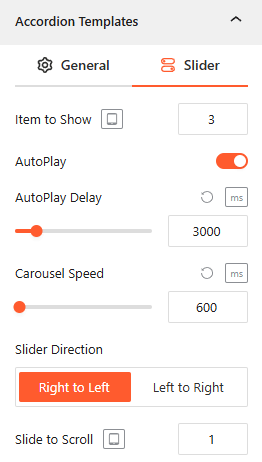
- Item to Show: Set the number of items visible in the slider at once, with responsive settings for different devices.
- AutoPlay: Toggle this on to allow the slider to transition between items automatically.
- AutoPlay Delay: If AutoPlay is ON, set the duration (in ms) that each slide stays visible.
- Carousel Speed: Define the speed (in ms) of the sliding transition effect.
- Slider Direction: Choose the movement flow of the slides, either Right to Left or Left to Right.
- Slide to Scroll: Specify how many items the slider should move during a single transition.
Navigation Arrow: General
Configure the behavior and placement of your navigation controls to ensure easy browsing:
- Arrow Position: Select the vertical or horizontal alignment of the arrows, such as Vertical Center.
- Visibility on Hover: Enable this to hide the arrows until the user hovers over the slider area.
- Arrow Style: Choose from a variety of icon shapes and directions (arrows, chevrons, etc.) to match your UI.
- Size & Gap: Adjust the pixel size of the icons and the gap distance between them and the slider edge.
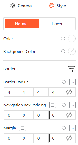
Navigation Arrow: Style
From the style panel, you can fully customize the navigation arrows for both Normal and Hover states by adjusting the icon color, background color, border settings, border-radius, navigation box padding, and external margin.
Pagination Dots: General
Configure the visual structure and spacing of the slider’s pagination indicators to improve user navigation:
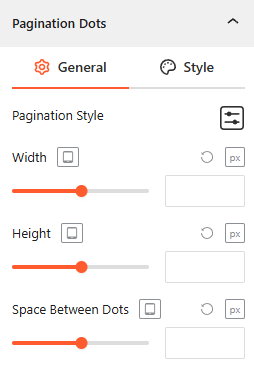
- Pagination Style: Select from diverse presets, including Dots, Dynamic, Strokes, Scrollbar, Stepper, Fraction, or Numbers to match your design preference.
- Width & Height: Set the exact pixel dimensions for the dots across different devices.
- Space Between Dots: Adjust the horizontal gap (in px) between each pagination indicator for a compact look.
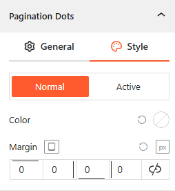
Pagination Dots: Style
You can fully customize the pagination dots for both Normal and Active states by adjusting the color and the external margin.
Accordion Interactions:
From the Accordion Interactions panel, you can define how panels trigger and scroll, ensuring a smooth and intuitive browsing experience for your visitors.
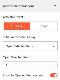
- Activator Event: Choose the trigger to open accordions: On Click, or Hover.
- Initial Display: Choose to have the Open First Item, Close All Items, or Open All Items on page load.
- Open Selected Item: Select it to set the number of accordion items you want to show on Click, while keeping other items collapsed.
- Scroll to Opened Item on Load: Enable it to scroll the browser to an active accordion immediately upon page entry.
Image: General
From the Image panel, you can manage the visual behavior, interactive effects, and Lightbox settings for each accordion item.
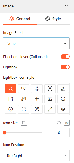
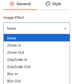
- Image Effect: Select from various visual styles, including Zoom In/Out, GrayScale In/Out, or Blur In/Out.
- Effect on Hover (Collapsed): Enable this toggle to trigger visual effects when a user hovers over an unexpanded item.
- Lightbox: Enable this feature to allow users to view images in a full-screen overlay.
- Lightbox Icon Style: Choose from 15+ different icon designs to represent the zoom action.
- Icon Size: Set the responsive pixel size of the Lightbox icon.
- Icon Position: Define where the icon appears on the image, such as Top Right, Top Left, Bottom Right, or Bottom Left.
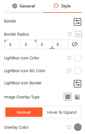
Style Image:
From this image style panel, you can easily customize the Image Typography, Border Radius, Overlay Colors, and Icon Backgrounds for both Normal and Hover states.
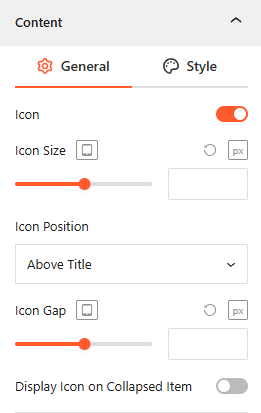
Content — General
From the Content panel, you can manage the visibility, layout, and styling of the text and interactive elements overlaying your images.
- Icon Integration: Toggle this on to enable an Icon, adjust its Size and Gap, and specify its position above the title or left of the contents.
- Show/Hide Title, Description & Button: Toggle the Title, Description, and Button switches to control which content appears on your accordions.
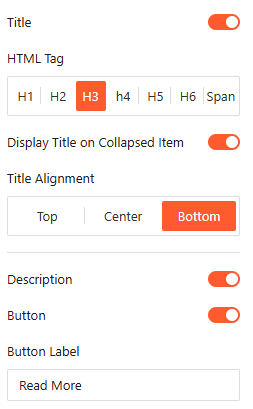
- Title Customization: Select the appropriate HTML Tag (H1–H6 or Span) and set the Title Alignment to Top, Center, or Bottom.
- Title Visibility: Choose whether to Display Title on Collapsed Item to keep headings visible even when the panel is closed.
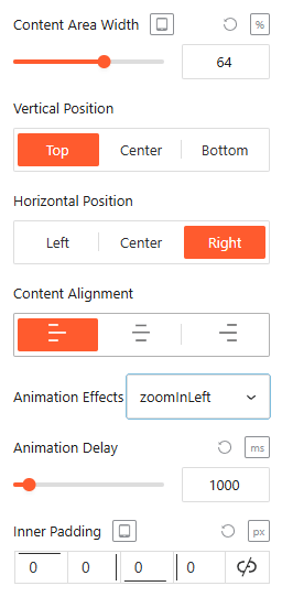
- Button: Customize the Button Label (e.g., “Read More”) and adjust the overall Content Position and alignment within the frame.
- Animation Effects: Apply dynamic Animation Effects like “zoomInDown” and set a specific Animation Delay (in ms) for an engaging entrance.
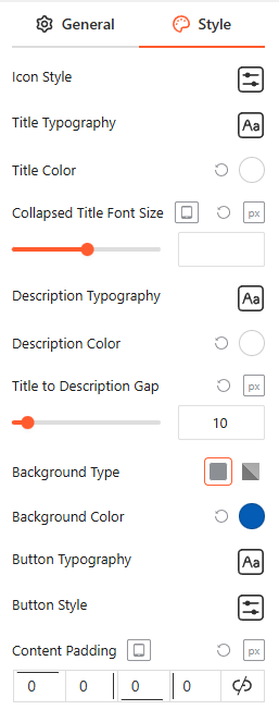
Style Content:
From the Content Style panel, you can customize Icon Style, Title, and Description Typography and Color, Collapsed Title Font Size, Title to Description Gap, Button Typography and Style, and Content Padding.
Motion Effects — General
From the Motion Effects panel, you can add animations and interactive movement to your accordion, making the content feel more dynamic as users scroll or interact.
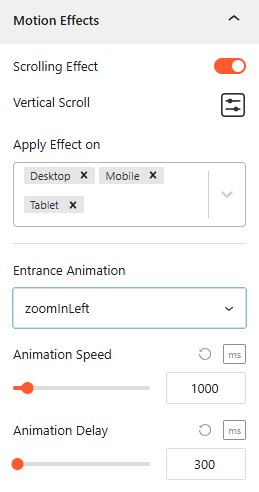
- Enable Scrolling Effects: Use this toggle to enable or disable scroll-based interactions for the block.
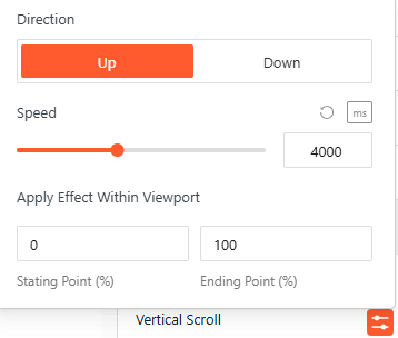
- Vertical Scroll: Define the animation Direction (Up/Down) and Speed, and apply the effect within specific viewport ranges.
- Apply Effect On: Choose which devices — Desktop, Tablet, or Mobile will display these motion effects.
- Entrance Animation: Select how the accordion appears when entering the viewport, with options like Fade In, Slide Up, Zoom In, or Bounce.
- Animation Speed & Delay: Precisely set the Animation Speed and adjust the Animation Delay (in ms) to control the timing of the reveal.
Advanced Settings:
The Advanced panel allows you to manage the overall container of the accordion, covering visibility, accessibility, and high-level styling.
General:
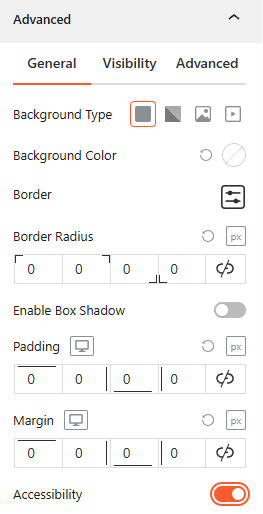
- Background & Border: Set the background type (Solid, Gradient, Image, or Video), border-radius, and box shadows for the main block container.
- Spacing: Define the precise Padding and Margin (in px) for the entire accordion structure.
- Accessibility: Enable this toggle to ensure the accordion follows standard web accessibility guidelines for screen readers and keyboard navigation.
Visibility:
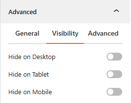
- Device Hiding: Toggle visibility on or off to hide the entire accordion block on Desktop, Tablet, or Mobile viewports for better responsive control.
Advanced:
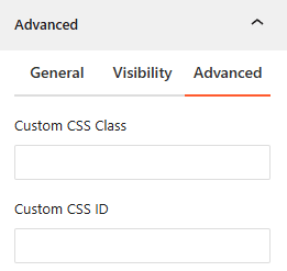
- Custom CSS: Apply a unique Custom CSS Class or Custom CSS ID to the block for deep styling or advanced developer hooks.