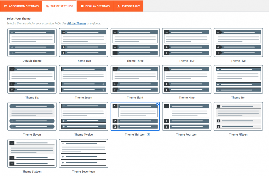
In the Easy Accordion plugin, the Accordion Settings tab is where you define the core behavior, layout, and functional interactions of your accordion group.
Note: Since WordPress upgraded from classic to Gutenberg, you can try our newly added drag and drop FAQs & Accordion blocks with a ready-to-use Pattern Library.
Based on the official documentation and common layout options, here is a breakdown of the primary configuration settings available:
1. Layouts and Theme Selection:
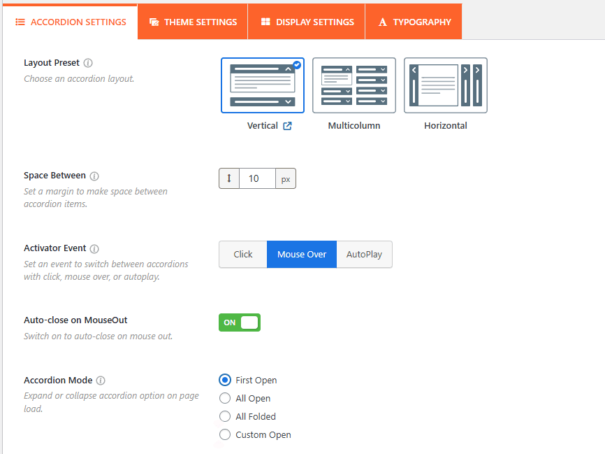
Choose Accordion Layout:
You can choose between different structural orientations, typically Vertical, Horizontal, or Multicolumn layouts.
- Also, you can set the accordion Interaction & Activator Events from this panel, allowing you to determine how a user triggers the accordion to open or close:
- Space Between: Adjust the space between the accordion items from here.
Accordion Interactions:
- Activator Event: You can set the trigger to Click (default), Mouseover (opens when hovering), or AutoPlay (items expand sequentially on their own).
- Auto-close On Mouseout: If using the Mouseover event, this setting allows the accordion item to automatically close when the user moves their cursor away from it.
- Accordion Mode (Initial Display): Controls how the accordion looks when the page first loads. Options include:
- First Open: Only the first item is expanded.
- All Open: All items are expanded by default.
- All Folded: All items are closed.
- Custom Open: Set the custom accordion to be opened.
Fixed Content Height: You can set a maximum height for the description area. If the content exceeds this height, a vertical scrollbar will appear within that specific accordion item.
Advanced Functional Settings:
- Multiple Opening Together: When set to ON, users can keep multiple accordion panels open at the same time. If set to OFF, opening a new item will automatically close the previously opened one.
- FAQ Search: Add a real-time search field above the accordion, and enable FAQ auto-suggest, allowing users to filter through specific questions instantly.
- Expand/Collapse All Button: Add a toggle button that allows users to expand or collapse every item in the accordion group with a single click.
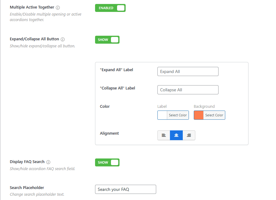
- Accordion Item to URL: Use this toggle to enable a URL for each accordion item.
- Scroll to Active Item: It automatically scrolls the page to align the expanded accordion header with the top of the viewport, which is highly useful for long FAQ lists.
- SEO Schema Markup: Enabling this option adds structured FAQ schema to your accordion, helping search engines like Google display your questions and answers directly in search results as rich snippets.
- Preloader: Display a loading image to prevent “page jerking” while the accordion content is being rendered in the background.
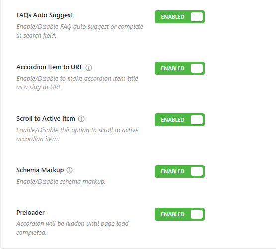
Select Accordion Theme:
It offers over 17+ pre-designed accordion themes, and it has been rebranded with accordion layouts. Each theme comes with unique styling, and a preview is usually visible directly below the selection to help you visualize the result.