
In the Easy Accordion plugin, the Display Settings panel allows you to control the visual presentation and interactive elements of your accordion. This section is divided into six main sub-groups: Title & Description, Expand & Collapse Icon, Product Information, Meta Data, Animation Effect, and Ajax Pagination.
Note: Since WordPress upgraded from classic to Gutenberg, you can try our newly added drag and drop FAQs & Accordion blocks with a ready-to-use Pattern Library.
Based on the provided interface screenshots, here is a detailed look at the Accordion Display Settings:
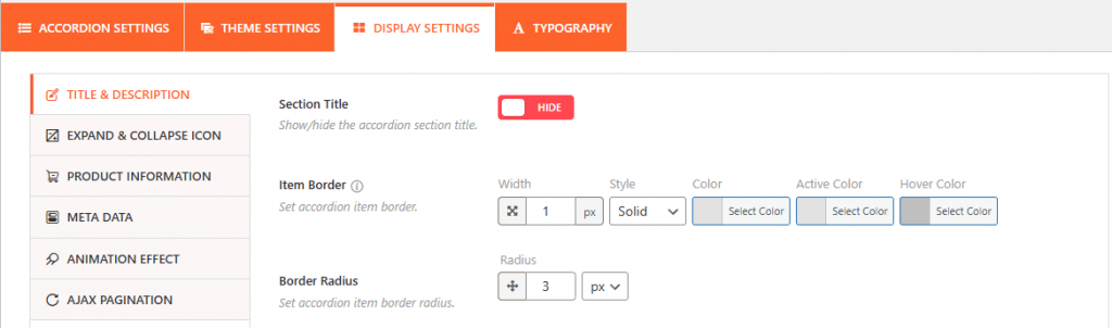
1. Title & Description Settings:
This section governs the general visibility and border styling of the accordion items.
- Section Title: A toggle to show or hide the main title for the entire accordion section.
- Item Border: You can customize the border for individual accordion items by setting the Width (in pixels), Style (e.g., Solid), and specific Colors for standard, active, and hover states.
- Border Radius: Allows you to round the corners of the accordion items for a softer look.
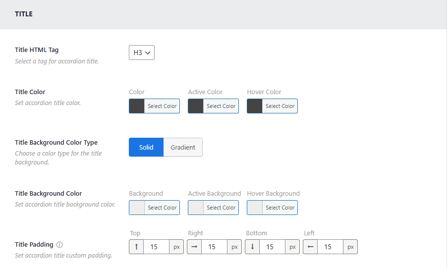
The plugin also offers granular control over the text elements within these panels:
- Title Styles: You can set the HTML Tag (e.g., H3), background colors (Solid or Gradient), and specific Padding for the title area.
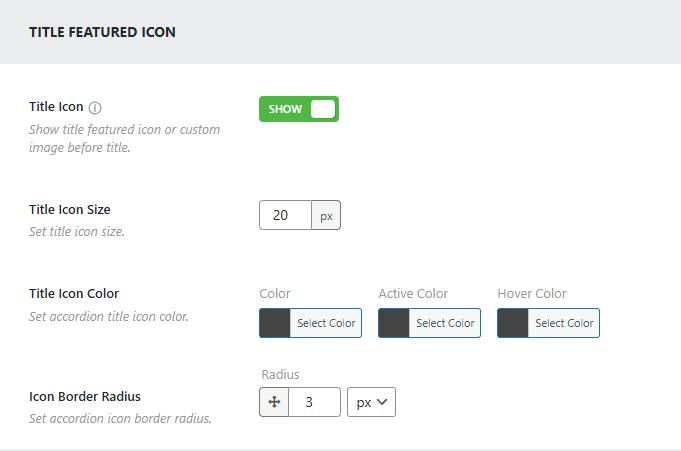
- Featured Icons: Beyond the expand/collapse icon, you can enable a Title Featured Icon or custom image to appear before the title.
- Description Content: For the inner content, you can set the text color, background color, and padding.
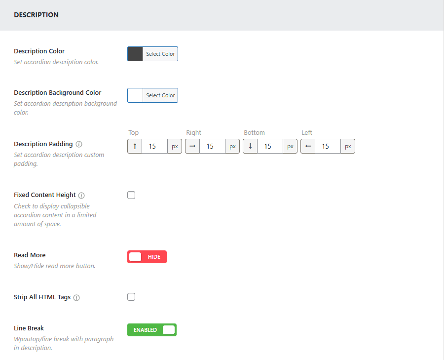
- Advanced options include Fixed Content Height (to add a scrollbar to long text), the ability to Strip All HTML Tags, and a toggle for Line Breaks.
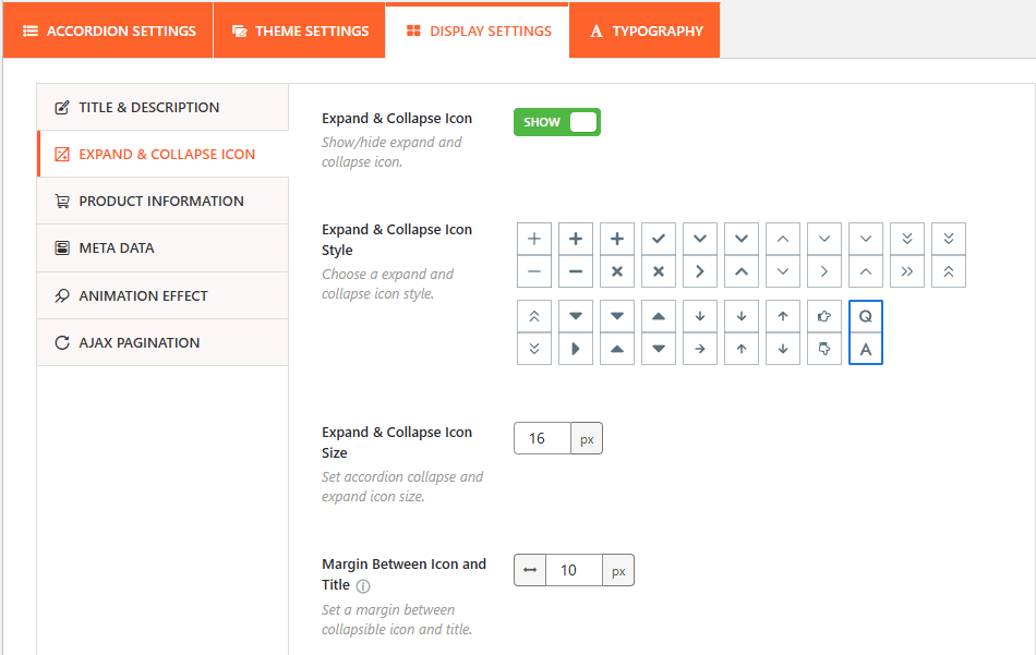
2. Expand & Collapse Icon:
These settings define the appearance and behavior of the icons used to trigger the accordion panels.
- Icon Visibility: Use this toggle to show or hide the expand/collapse icons entirely.
- Icon Style: Choose from a wide variety of icon sets, including plus/minus signs, arrows, chevrons, and folder icons. Beyond setting the icon, you will also be able to customize the icon as needed:
- Size: Set the specific pixel size for the icons.
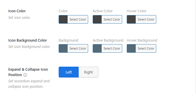
- Position: Place the icon on either the Left or Right side of the title.
- Coloring: Set individual colors for standard, active, and hover states to match your site’s branding.
- Margin: Adjust the spacing between the icon and the title text.
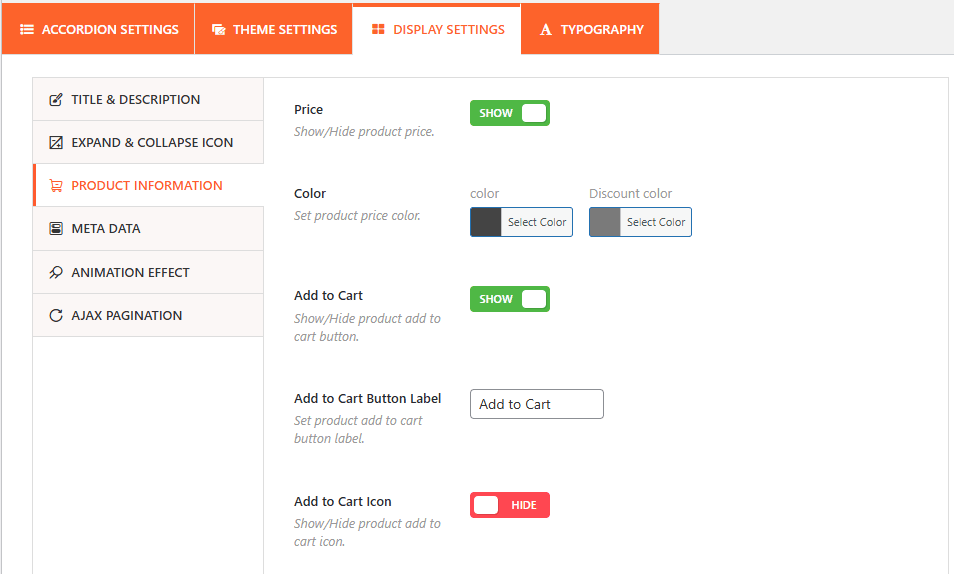
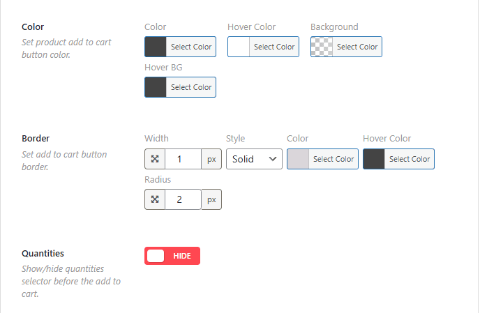
3. Product Information:
From this panel, you can easily show or hide product prices, the Add to Cart Button, and customize each one as needed.
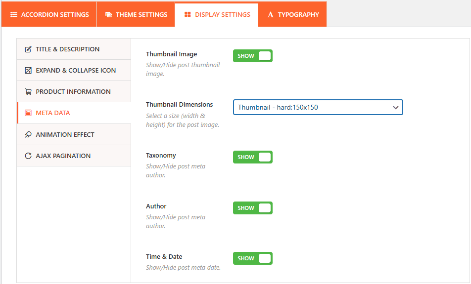
4. Metadata:
The Metadata panel allows you to show or hide thumnail image and choose its size, disable the Taxonomy, Author, and other post meta.
5. Animation Effect
Control the motion and speed of the accordion as it opens and closes.
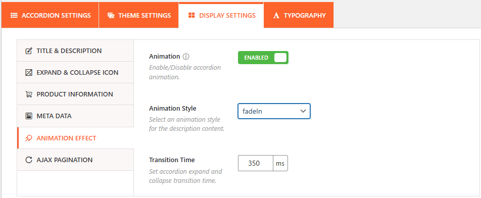
- Enable Animation: Use this toggle to turn all accordion animations on or off.
- Animation Style: Select the specific visual effect for the content transition, such as fadeIn and more.
- Transition Time: Define how long the animation lasts in milliseconds (e.g., 350ms) to ensure a smooth user experience.
5. Ajax Pagination
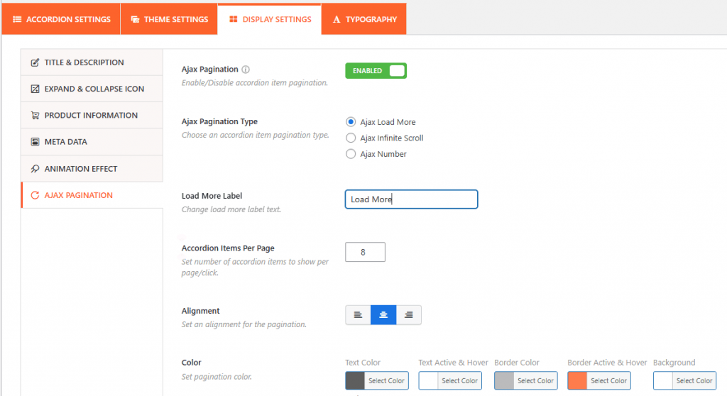
- Ajax Pagination Toggle: This feature can be enabled or disabled to allow the accordion items to be paginated. Using Ajax ensures that new pages of accordion items load without requiring a full page refresh.